The Crate Escape
A responsive website design and new branding for a fictional nonprofit pet adoption organization
Project Background
Around 6.5 million companion animals enter U.S. animal shelters nationwide every year, mostly cats (3.2 million) and dogs (3.3 million). Each year, about 1.5 million shelter animals are euthanized (670,000 dogs and 860,000 cats) and around 3.2 million shelter animals are adopted.
The Crate Escape is looking to partner with shelters all over the country—and eventually worldwide—to create a platform that allows people to see all the available animals in any shelter close (or not) to them. Awareness and discoverability are the primary things The Crate Escape wants to address.
*The Crate Escape is a fictional company
Project Details
Client: The Crate Escape
Role: UX/UI Designer
Team: Solo, with mentor guidance
Deliverables: Responsive website design, desktop website prototype, new branding
Duration: 80 hours
Tools: Sketch, Illustrator, Photoshop, InVision
Objectives
- Design a responsive website that covers core functionality: search for pets, information about specific pets, and information about The Crate Escape and other shelters
- Build and define The Crate Escape’s brand
- Create a website to address discoverability and awareness of animals in need of adoption
Design Process
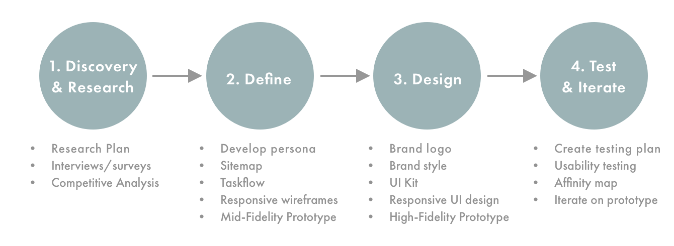
1. Discovery & Research
Process: Market Research / Competitive Analysis / Contextual Interviews / Surveys
Market Research
I began my market research by exploring pet adoption statistics and the reasons why so many dogs and cats end up at shelters.
Summary of Findings
- The ASPCA estimates that 5-7 million animals enter shelters each year, while other organizations estimate it’s actually up to 8 million animals. The two main reasons animals are in shelters are because people give them up or animal control finds them on the street.
- Only 10 - 20% of the dogs and cats owned in the U.S. are adopted from a shelter. It’s also estimated that 25% of shelter dogs are purebreds.
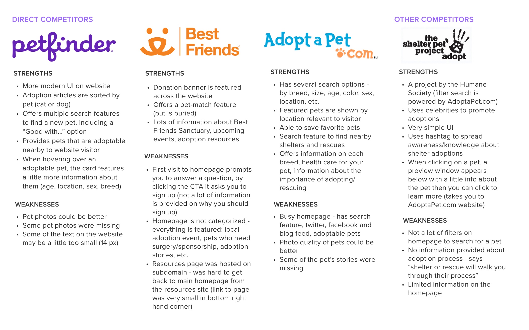
- All of The Crate Escape’s competitors used some type of filter on the homepage to help a user quickly find an animal they were looking for.
- It will be key for The Crate Escape to have information about the organization, the pet adoption process, and other adoption resources neatly organized so users can find the information they are looking for and to not overwhelm a visitor when they first come to the website.
Competitive Analysis
The Crate Escape wants to partner with shelters from all over the country so it was important to look at direct competitors that had websites similar to the concept The Crate Escape wanted to create.
Contextual Interviews
I needed to have a clear understanding of what information on (or not on) a pet adoption website was valuable to prospective adopters and to those who had recently adopted. I put together an interview guide consisting of 10 questions with my goals of the research to learn how a user uses online sites to search for a new pet, uncover consumers’ motivations for adopting and any frustrations they faced (or are anticipating facing) during the adoption process and better understand the process a user makes when selecting a pet to adopt or visit at a shelter.
After completing my interviews, I synthesized the feedback I gathered to determine potential users needs, wants and desires in a pet adoption website:
Needs:
- An easy way to search and filter for pets by age, breed, size, sex, and temperament
- To easily find information about the shelter location, adoption fees, adoption application information and the adoption process
Wants:
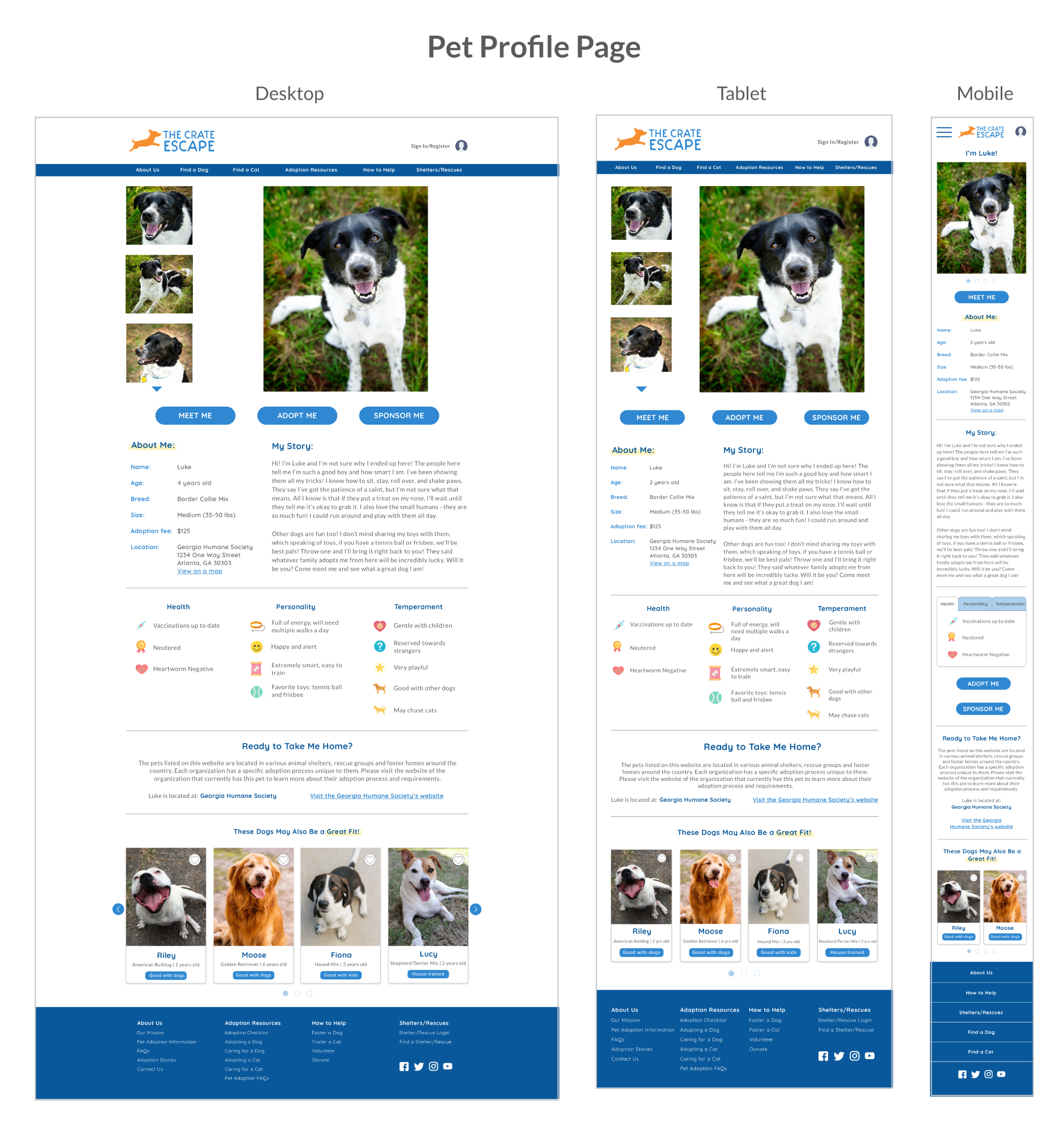
- A brief story about the pet to learn more about their personality, temperament, medical history, even how they ended up at the shelter (was it an owner surrender, found as a stray?), what things the pet likes (belly rubs, squeaky toys?)
- To see a high-quality photo of the pet that highlights their personality, even multiple photos of the pet
- 100% transparency on the pet’s medical history or any past trauma the pet experienced
Desires:
- Videos of the pet to help show more of the pet’s personality
- An easy way to schedule a visit with a prospective pet to be adopted, including bringing other current pets to meet the potential new pet
2. Define
Process: Develop Persona / Sitemap / Taskflow / Responsive wireframes / Mid-Fidelity Prototype
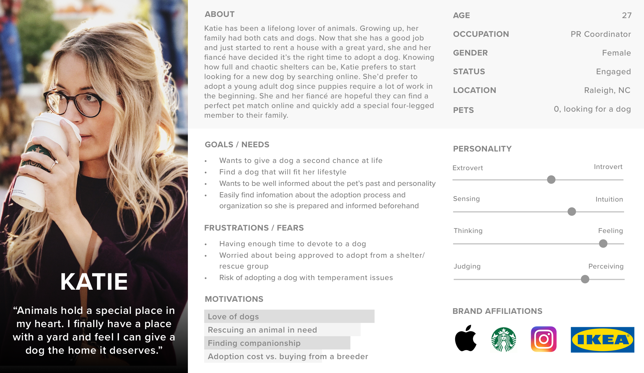
After conducting my research, I developed a persona for The Crate Escape’s website, Katie. All of my interviewees and survey takers had big hearts for animals and were passionate about rescuing or adopting a pet in need.
While the demographics and pet ownership experiences from my research varied, I focused on creating a persona who had previously owned pets growing up but was now looking to add a new furry member to her family.
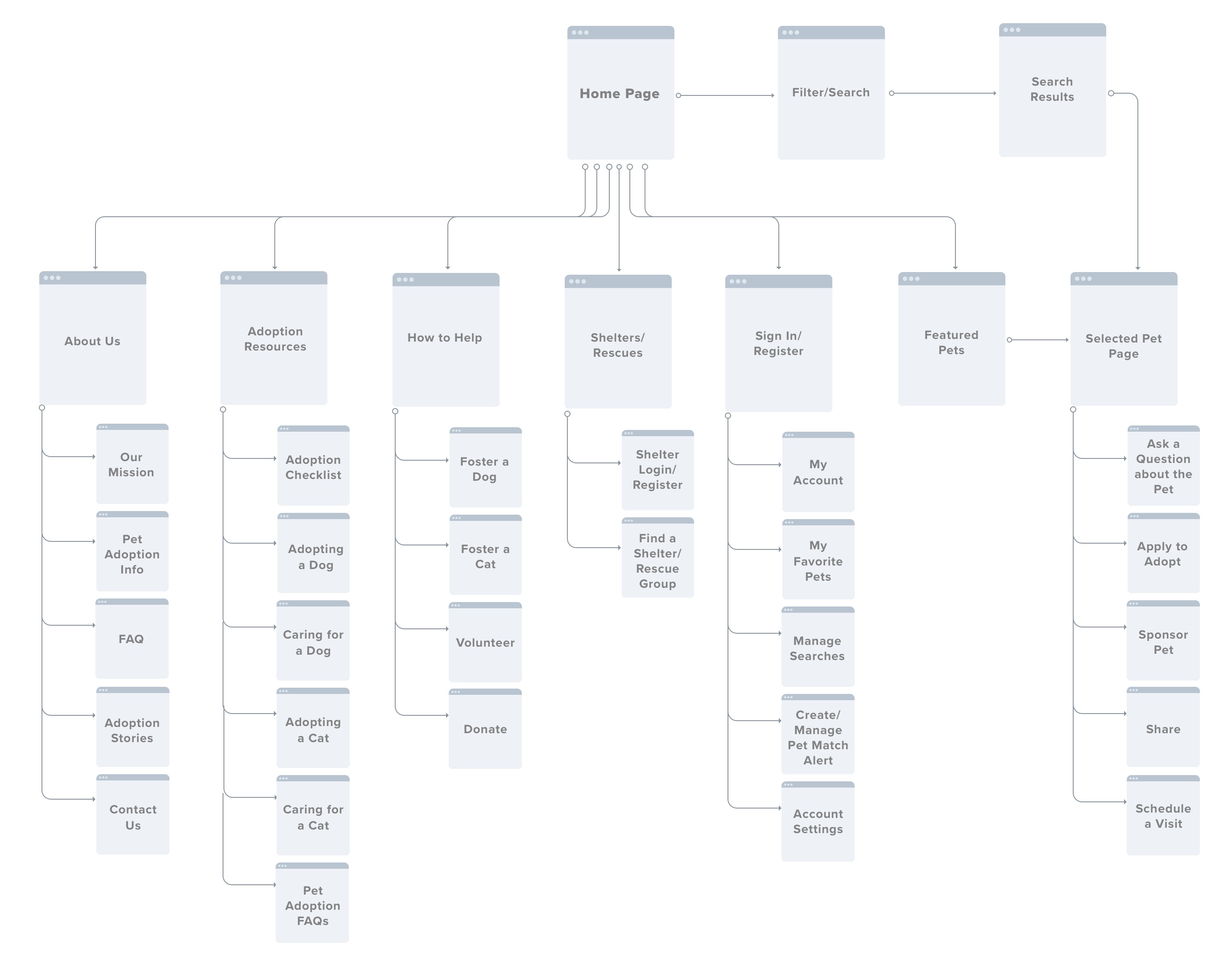
To develop the sitemap, I analyzed the websites I reviewed during my competitive analysis to get a feel of how they were structured to start a basis for The Crate Escape’s website.
Learning about the adoption process and pet adoption in general was very important to my interviewees so I wanted to make sure there were plenty of ways to access vital information about the process prior to completing an adoption.
Having a way to meet a prospective pet was also mentioned multiple times during my interviews, so including a schedule, a visit page to meet a potential new pet was essential as well.
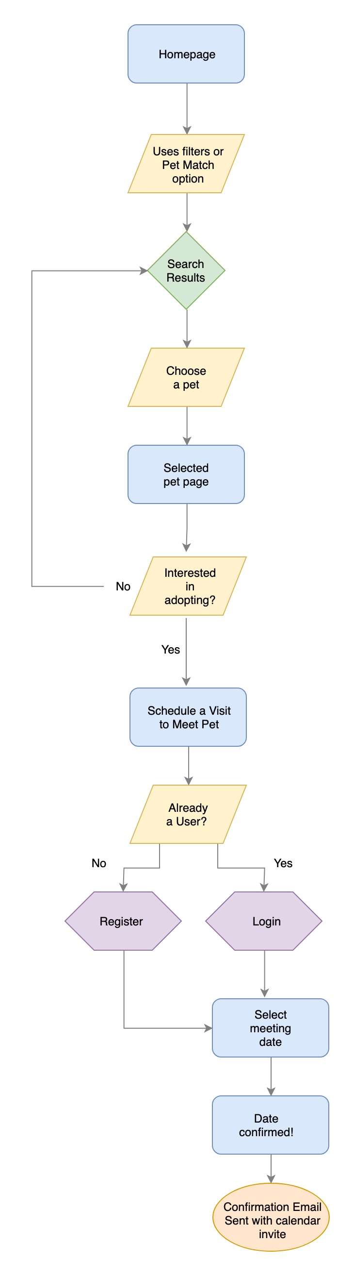
The task flow provides an overview of the process a user would take to schedule a meeting with a potential pet. Assuming a user enters from the homepage, they would use the initial filters on the homepage to filter pets they would like to see in the search results.
Once a user finds a pet they are interested in meeting, they would click a button on the pet’s profile page to schedule a meeting with the pet. Then the site would prompt the user to log in or register prior to scheduling so the user's information could be logged and used to correspond with them after the meeting date has been confirmed.
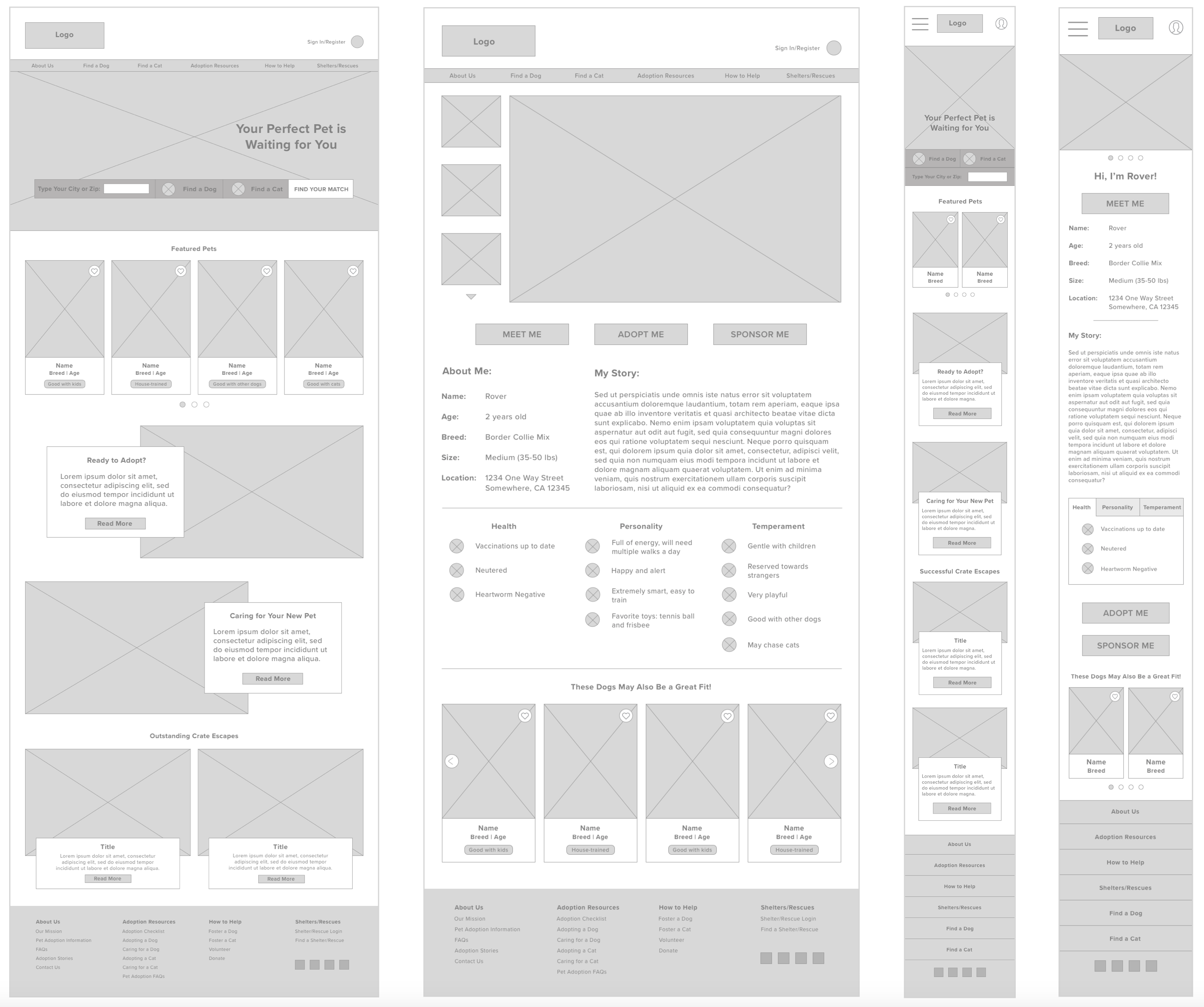
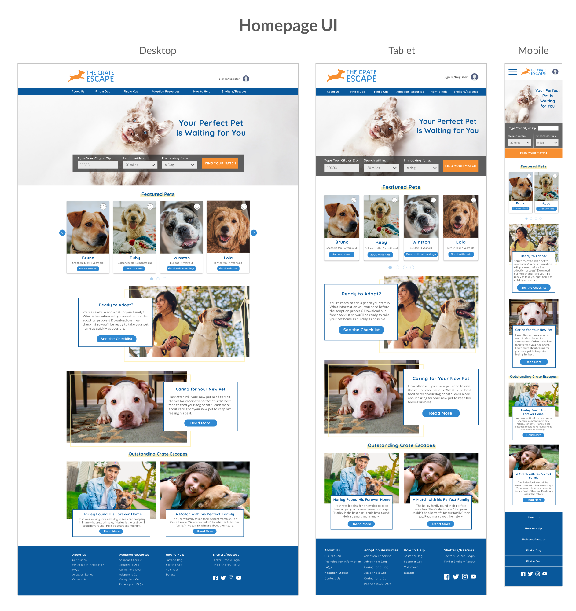
I started mocking up the wireframes in Sketch for my Mid-Fidelity prototype. Following my user task flow, I focused on creating the pages a user would visit as they scheduled an appointment to meet a potential pet.
3. Design
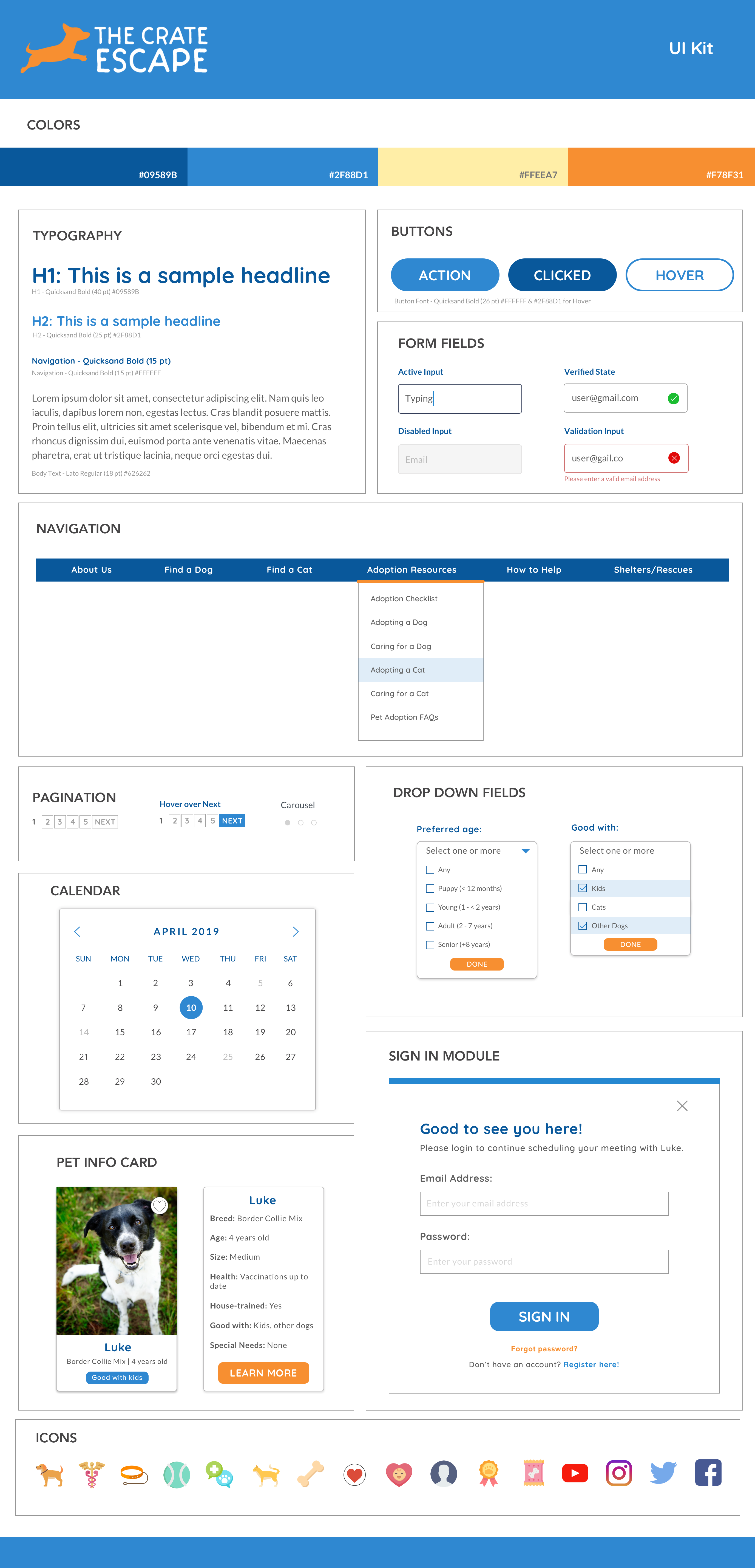
Process: Logo / UI Kit / High-Fidelity Prototype
When I decided on The Crate Escape’s business name at the beginning (originally called DYR), I had a vague logo idea in mind of a dog running — or rather, escaping from the crate.
I knew I wanted to choose happy and playful colors for the branding as I felt a nonprofit such as a pet adoption organization would be focused on creating joyful experiences between prospective adopters and new pets.
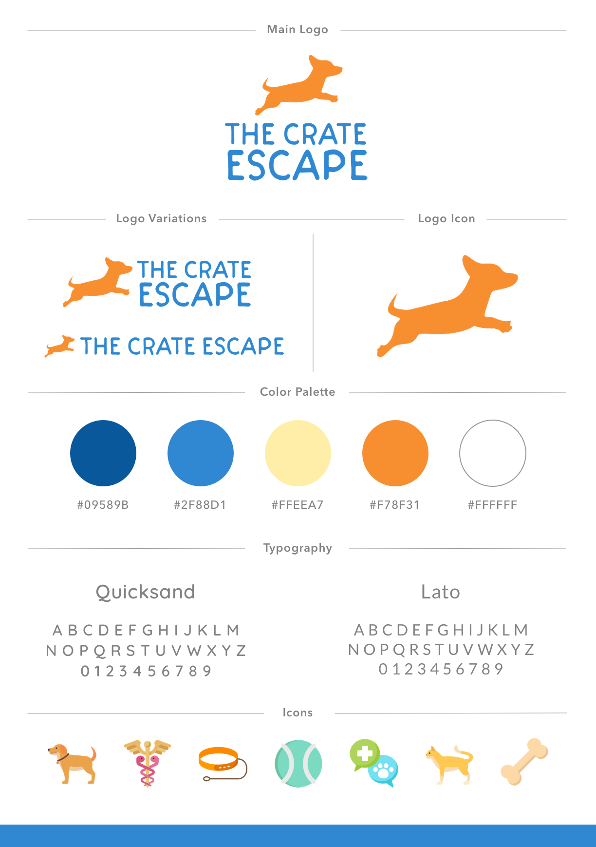
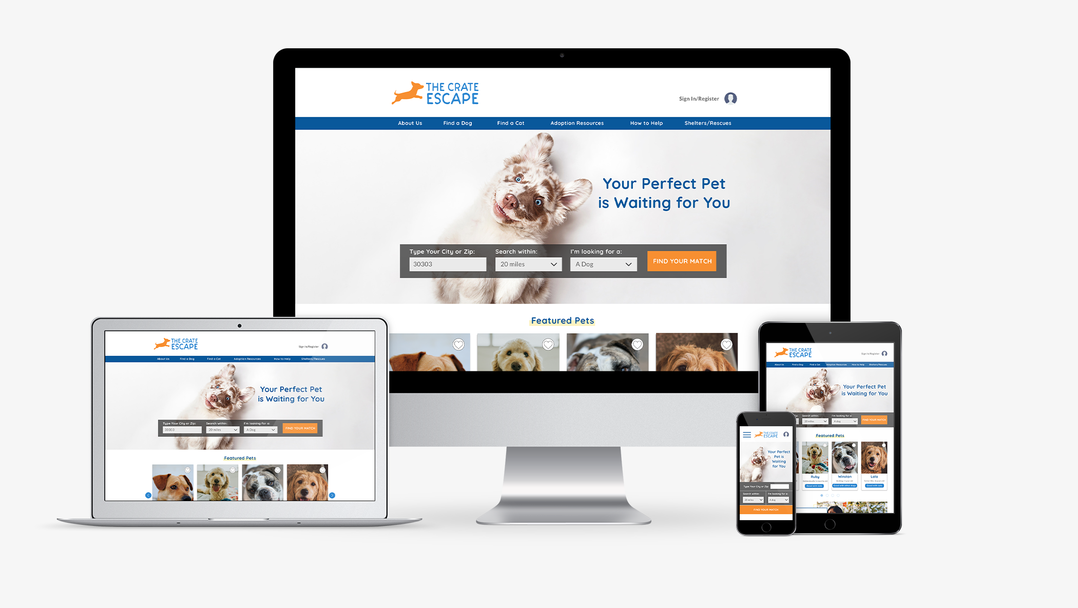
For The Crate Escape’s UI, I wanted to keep it clean, modern, and simple with the goal of not overwhelming a visitor when they first visit. Pulling from my style kit, I used the blues throughout the design with a few orange buttons as a pop of color to draw the eye towards an action for the user to take.
My goal was to keep things intuitive with simple labels for filters and the main navigation so a user could easily find what they were looking for.
4. Test & Iterate
Process: High-Fidelity Prototype / Usability Testing / Affinity Map
Implementing the new UI on The Crate Escape's site, I then created the high-fidelity screens in Sketch and created the prototype in InVision.
Once the high-fidelity prototype was ready, I performed usability testing with 4 potential users of the site. My test objectives were to:
- Test the overall quality and ease of use regarding the navigation and flow of the design
- Test how easy it is for the user to utilize the filters
- Test the ease of use to schedule a meeting with a pet
- Identify any inconsistencies in the site features
- Determine if there are any features that create hesitation, confusion or difficulties
The test goals were to understand how users would interact with the site and identify any areas of improvement that would eliminate areas of confusion or create difficulties for users.
Usability Testing Feedback & Iterations
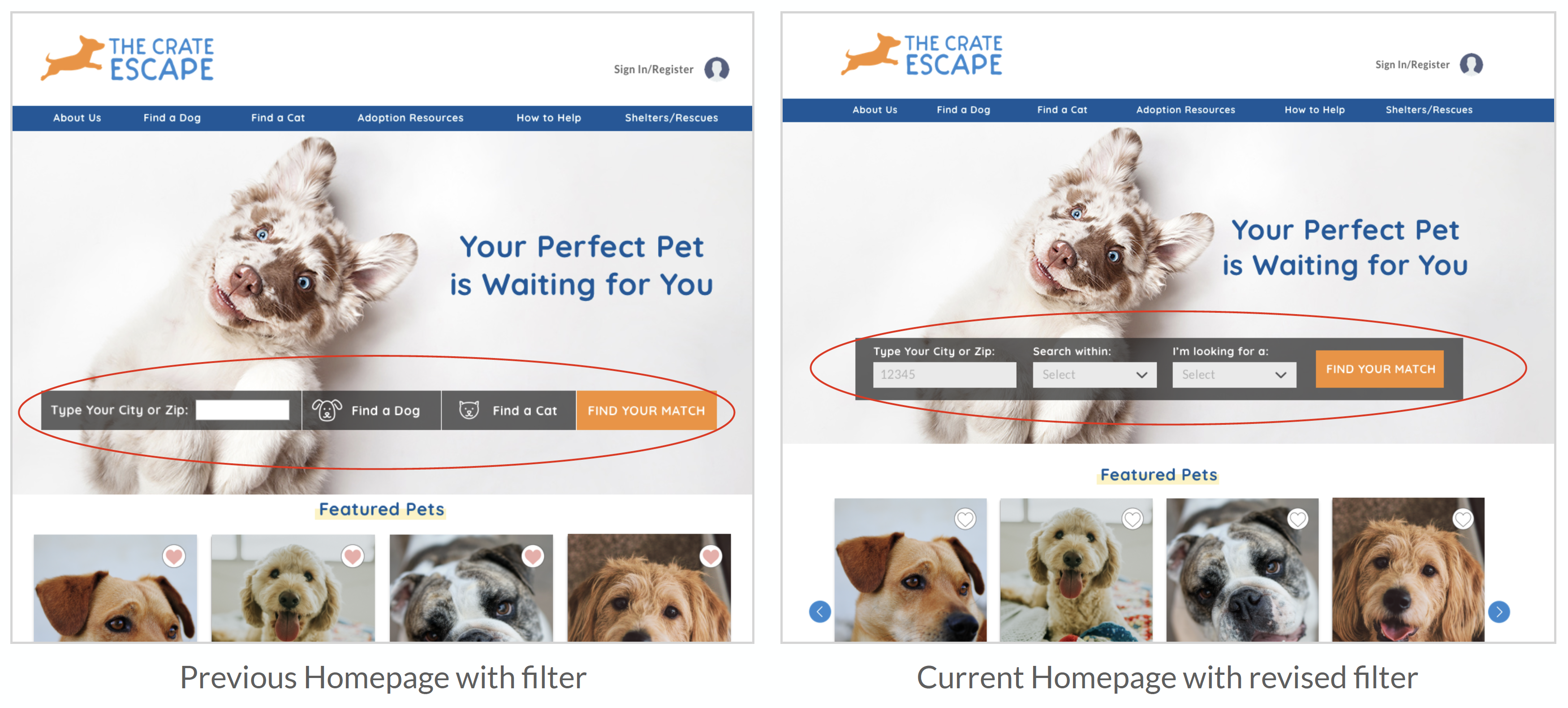
After completing the first round of usability tests on the High-Fidelity prototype, I made the highest priority round of revisions. One of the patterns I uncovered during testing was the confusion my original homepage filter created. With a few conflicting calls-to-action, users were unsure of which button would bring them to the search results page from the homepage. I reorganized the homepage filter to include a drop-down option to make the one call-to-action more prominent.
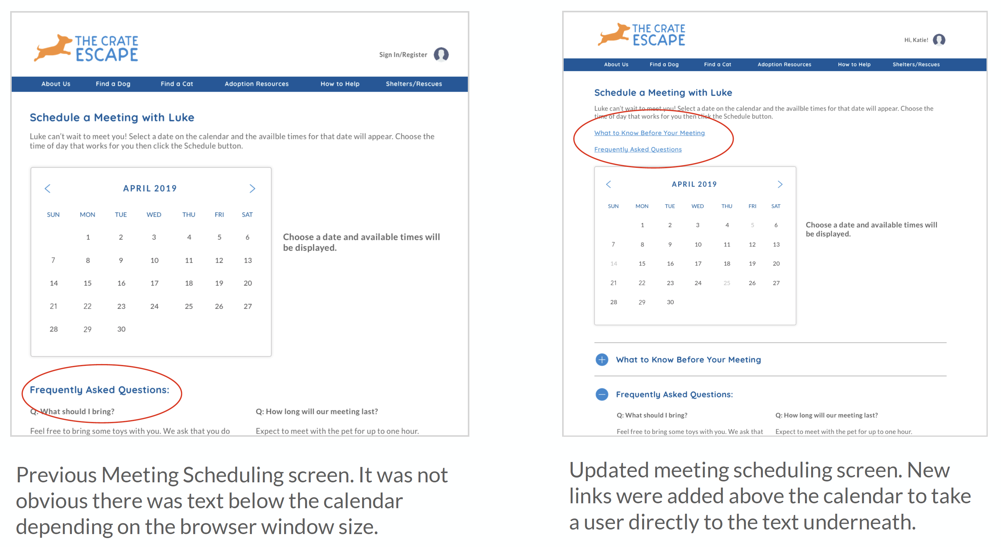
I also noted due to the size of the browser windows, it was not apparent to a couple of users on the meeting scheduling page that there was helpful text about what to know before meeting a prospective pet underneath the calendar. I added links to the text below the calendar so the user will be taken directly to the anchor text.
Next Steps
The next steps will be to build out additional pages to encourage the users to browse the site more then complete an additional round of usability testing on the updated prototype before preparing the site for developer handoff.
View more projects
MirrorE-commerce | Responsive Design | UX/UI | Branding
The Crate EscapeNonprofit | Responsive Design | UX/UI | Branding
Georgia's Own Credit UnionFinTech | Feature within an App | UX/UI
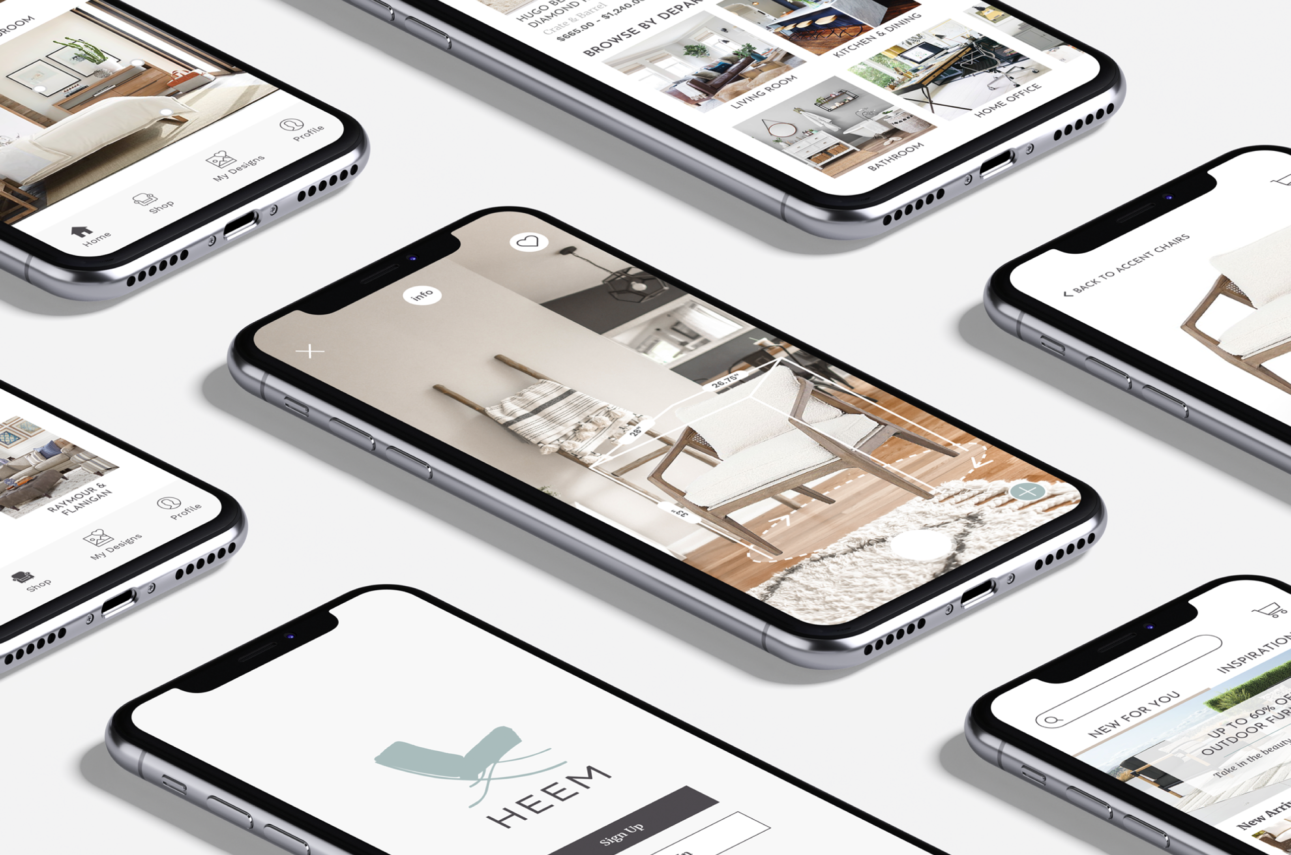
HeemAugmented Reality | End-to-End Mobile App | UX/UI | Branding