Mirror
A responsive website and updated branding for a fictional e-commerce company
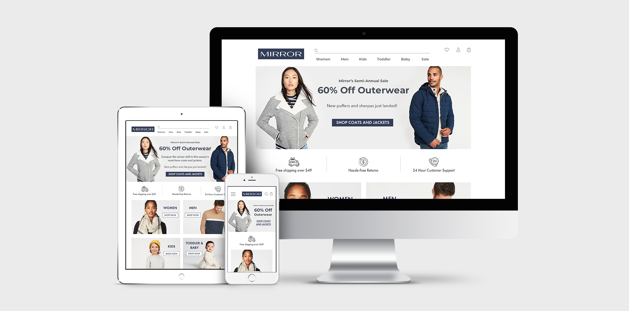
Project Background
Mirror is a global clothing retailer that has been very successful in their physical locations around the world. Founded in 1994, they have grown to over 400 stores around the world in 32 countries.
One of their beliefs is that people should be able to change and update their styles as they please, at an affordable price. They provide a range of styles, from casual to business, sport to formal, targeted to women, men and children.
To meet growing customer demands and to help sell the excess inventory they are holding in their warehouses, Mirror is looking to build a new user-friendly, e-commerce website.
*Mirror is a fictional company
Project Details
Client: Mirror
Role: UX/UI Designer
Team: Solo, with mentor guidance
Deliverables: Responsive website design, desktop website prototype, updated branding
Duration: 80 hours
Tools: Sketch, Illustrator, Photoshop, InVision, Zeplin
Objectives
- Invest in a digital presence
- Build a new responsive website
- Refresh their logo
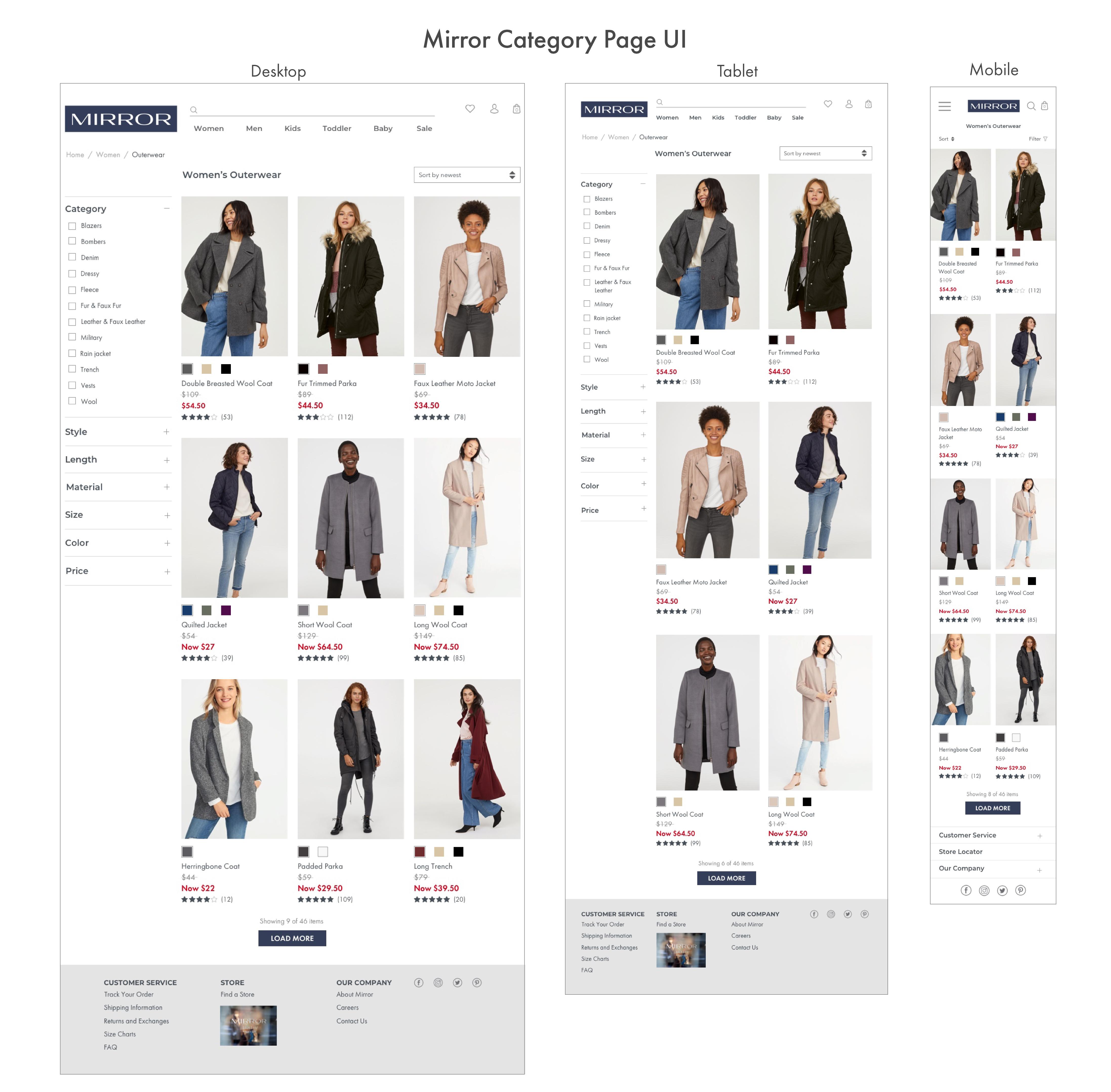
- Improve users shopping experience by creating an easy way to browse and filter products
Design Process

1. Research
Process: Market Research / Competitive Analysis / Contextual Interviews
Market Research
To begin my research, I started by exploring information on the e-commerce clothing industry. I also wanted to understand emerging trends for online retail.
Summary of Findings
- In 2017, online retailers saw an increase of over 24% year over year growth in ecommerce. A few retail trends predicted in 2018 include personalization, community (i.e. Sephora’s Beauty Insider), and a focus on the entire purchasing experience (from suggesting items, to delivery notifications and follow up communications).
- The 30-39 age group makes up the majority of the online shopping frequency (37%), with the 18-29 group falling closly behind (35%). (source)
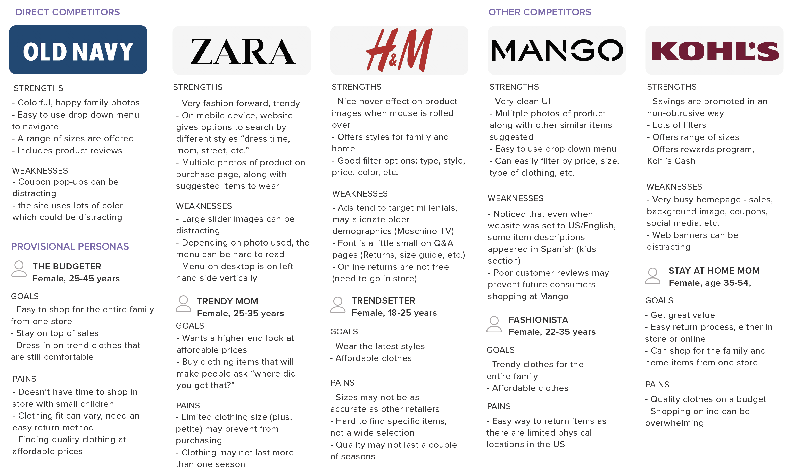
- While the colorful images and bright graphics can be eye catching (Old Navy and Kohl’s), they may feel overwhelming to some consumers. Easy to use menus and filters with a clean UI should help users navigate to items they’re interested in purchasing.
Competitive Analysis
It was important to understand Mirror’s direct competitors and learn the strengths of weaknesses of other online clothing store’s websites. Mirror's target audience was those who didn't believe clothing had to be expensive and last forever, as well as those who were seeking quality clothing at affordable prices.
Contextual Interviews
To better understand Mirror’s target consumer's shopping habits, preferences, and challenges they face when shopping online, I interviewed 4 potential users. Participants were both male and female, between ages 30-61 years old. A summary of my interview findings are below:
Needs:
- Users need a responsive website to shop on their desktop or their phone
- Users need a way to filter through search results (size, color, type, fabric, brand, sleeve length, etc.)
Wants:
- Users want a way to easily apply coupons and savings to their cart without having to enter an email address
- Users want an easy way to make returns, either through free return shipping or being able to return to a store
- Users want to be able to determine the appropriate size to order
Desires:
- Users desire a sample item shipped along with their purchase (ex. perfume or small accessory)
- Users desire an unobtrusive way to browse while shopping online (no pop-ups)
- Users desire a rewards program to enjoy additional savings
2. Define
Process: Empathy Map / Develop Persona / Storyboard
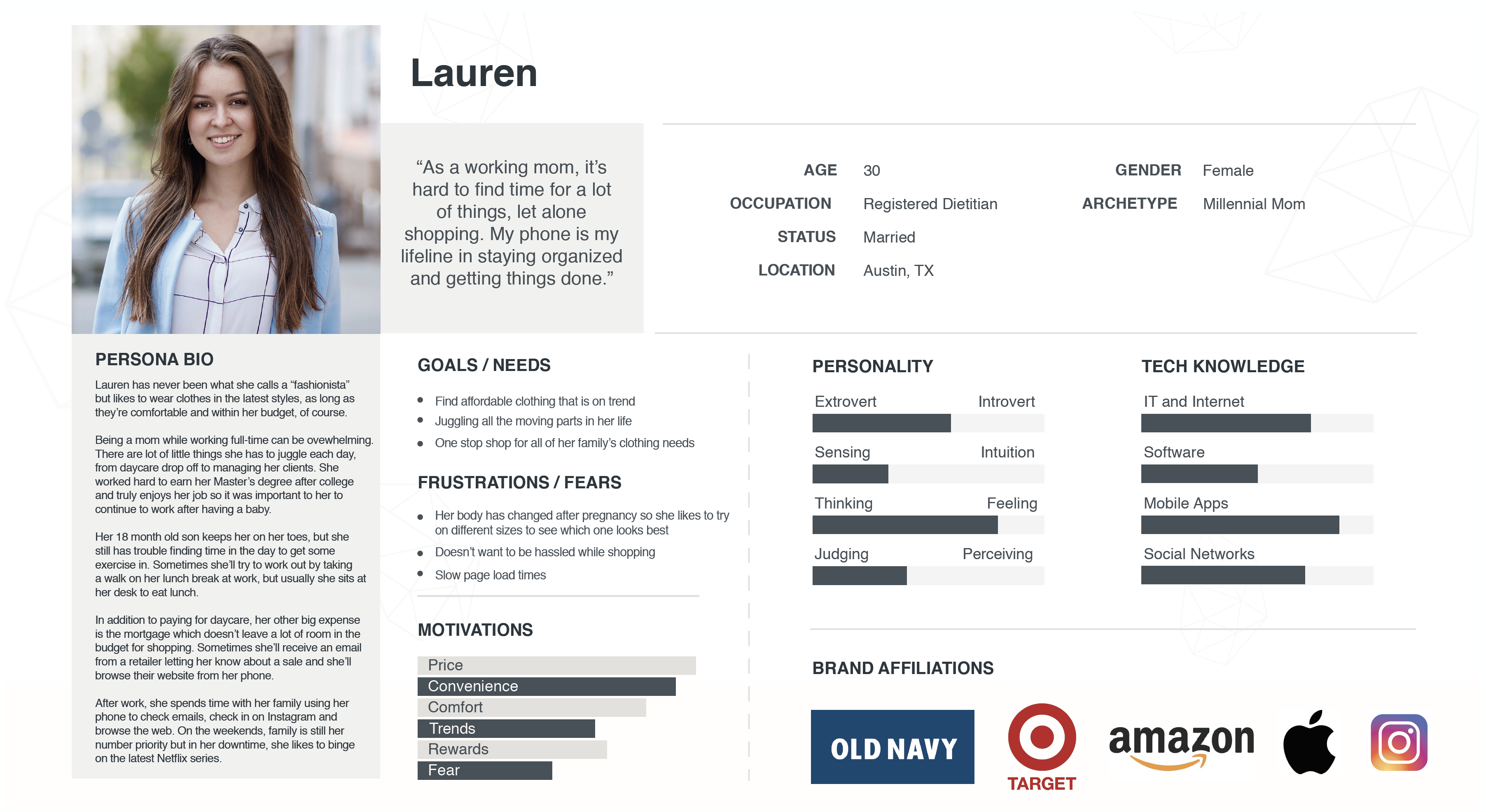
Based on the research and data gathered from my interview findings, I developed an empathy map and a persona, Lauren, to better empathize with Mirror's target user.
3. Ideate
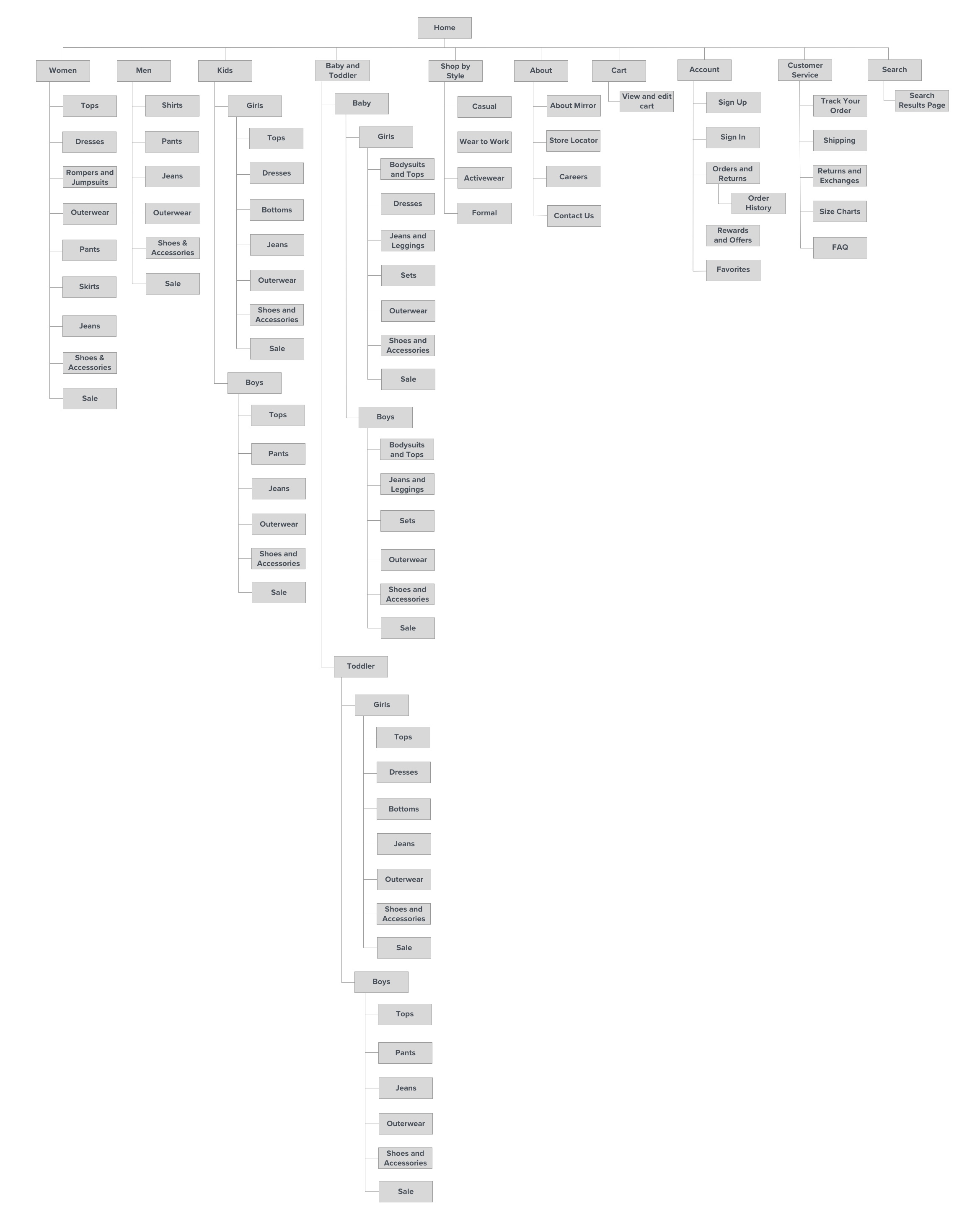
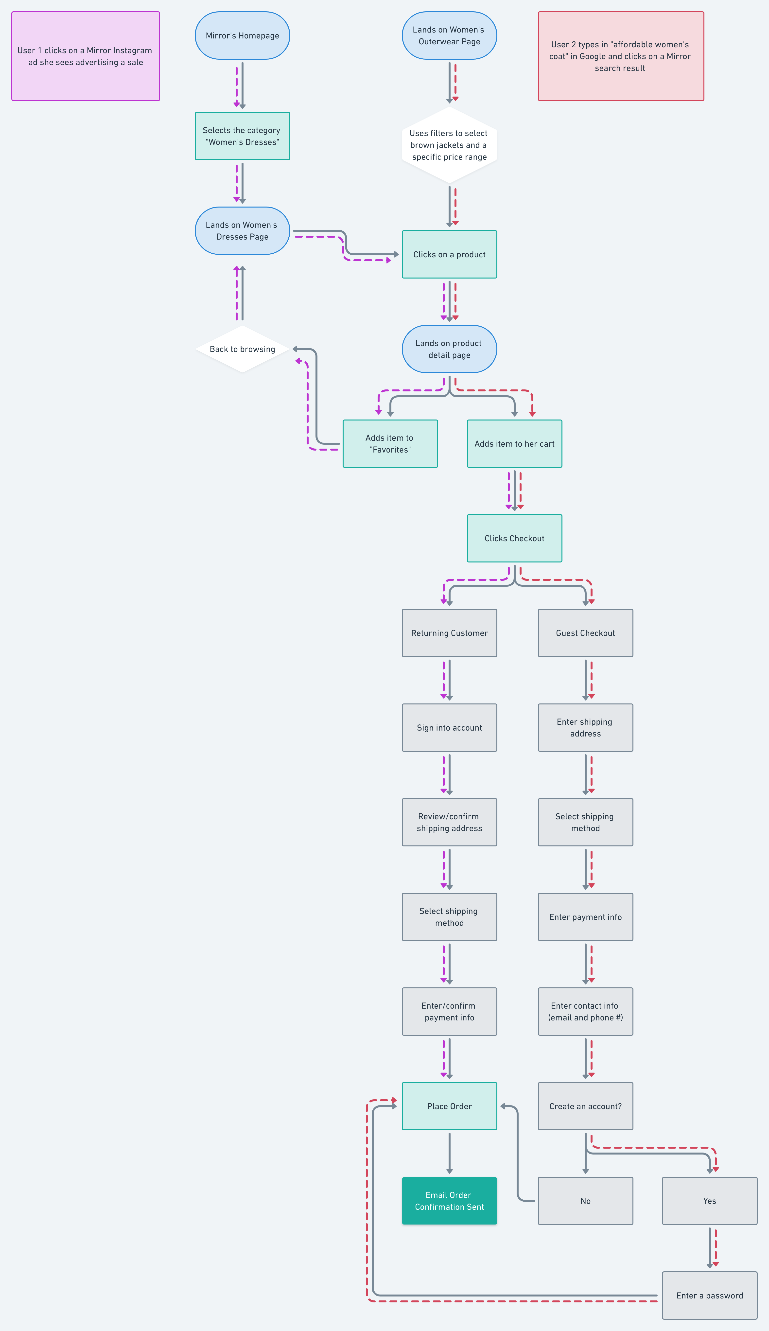
Process: Card Sorting / Sitemap / Task Flow / User Flow
4. Design
Process: Sketches / Mid-fidelity wireframes / Branding / UI
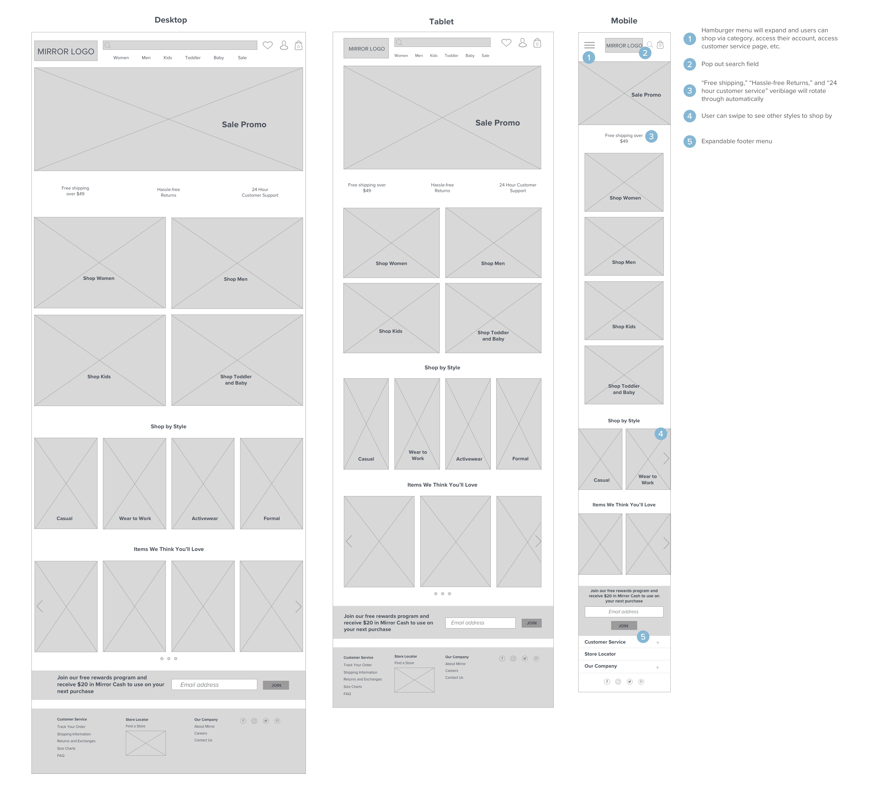
After hand sketching a few various homepage layouts, I begin designing the mid-fidelity responsive wireframes in Sketch.
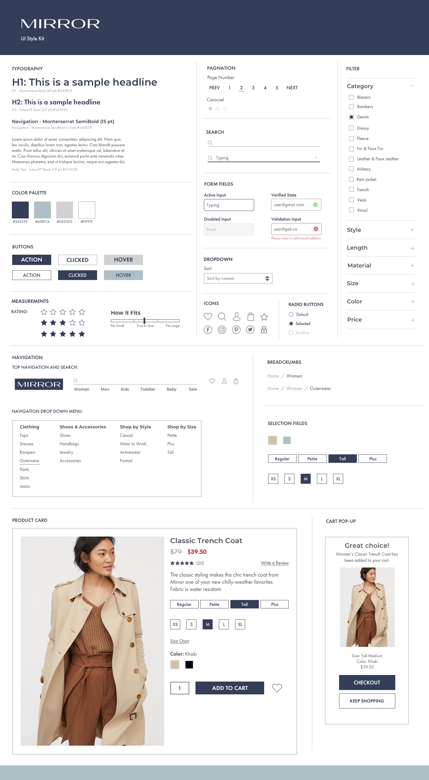
Mirror wanted updated branding for their new website so I drafted several logo ideas, keeping in mind they were looking for something modern and neutral to attract all types of peoples and styles. My goal for the overall feel of the website was to keep the UI modern and fresh while being clean and clear.
5. Test
Process: High-Fidelity Prototype / Usability Testing
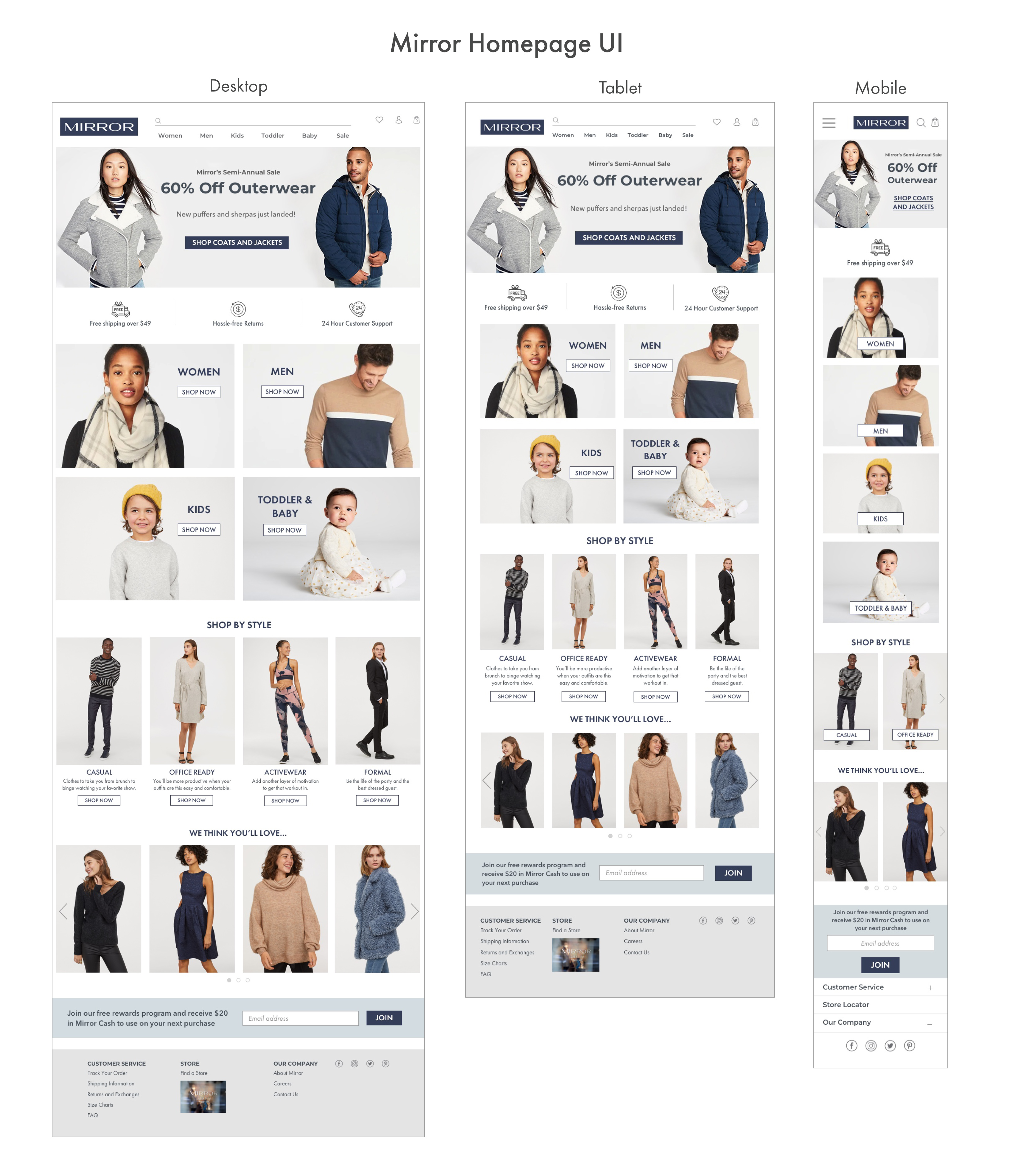
Using the updated branding and style kit, I created the high-fidelity wireframes in Sketch and created the prototype in InVision.
Next Steps
After completing usability testing, I made high priority revisions gathered from the feedback I received. I also prepared the high-fidelity prototype for handoff using Zeplin.
The next steps will be to create more clickable hotspots on the prototype to encourage users to browse and engage with the site more and complete additional user testing.
View more projects
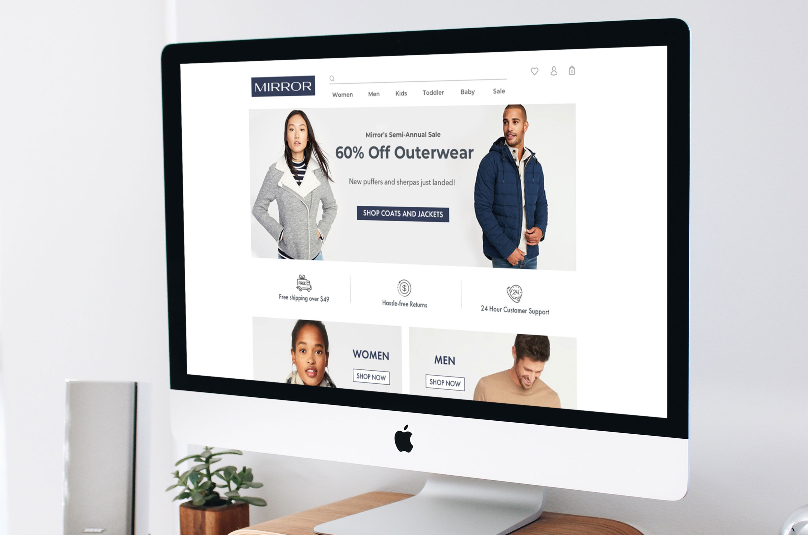
MirrorE-commerce | Responsive Design | UX/UI | Branding
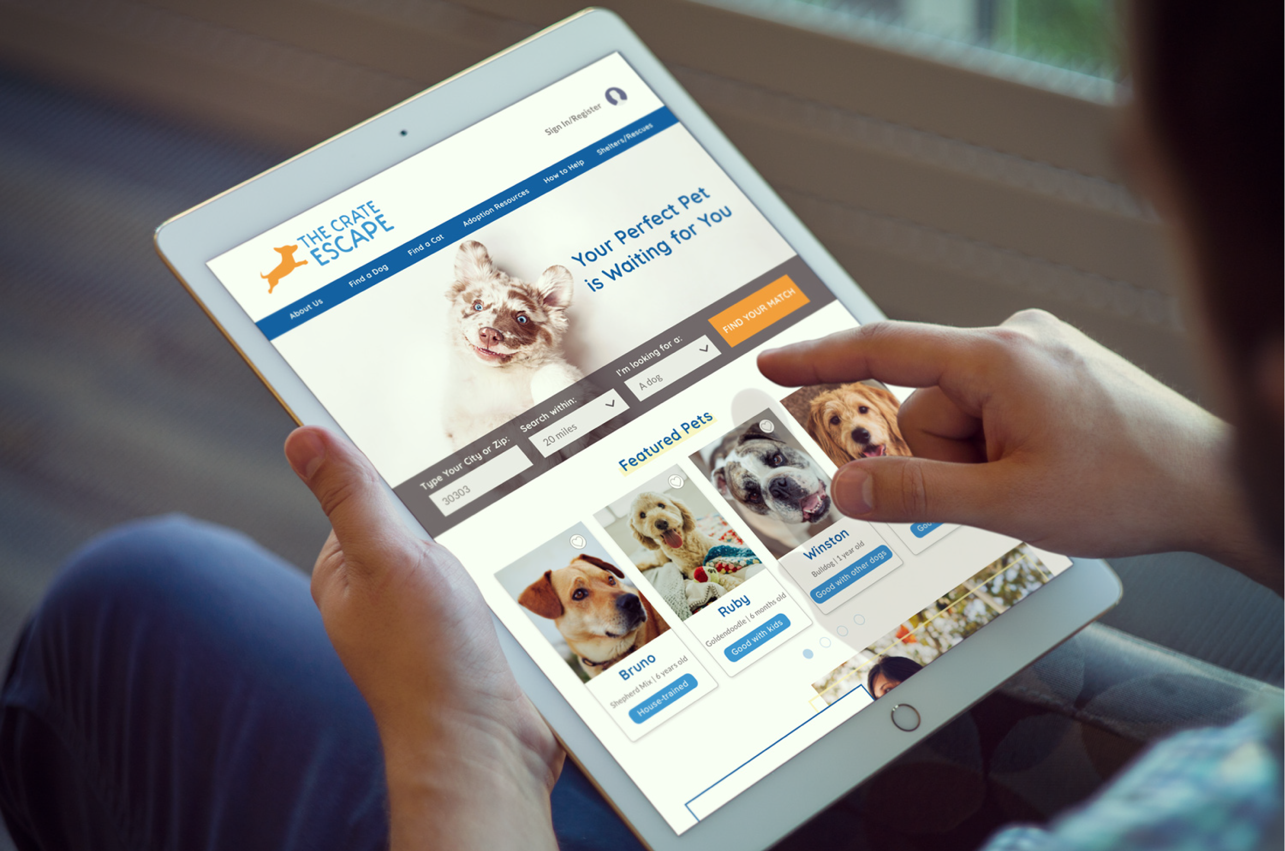
The Crate EscapeNonprofit | Responsive Design | UX/UI | Branding
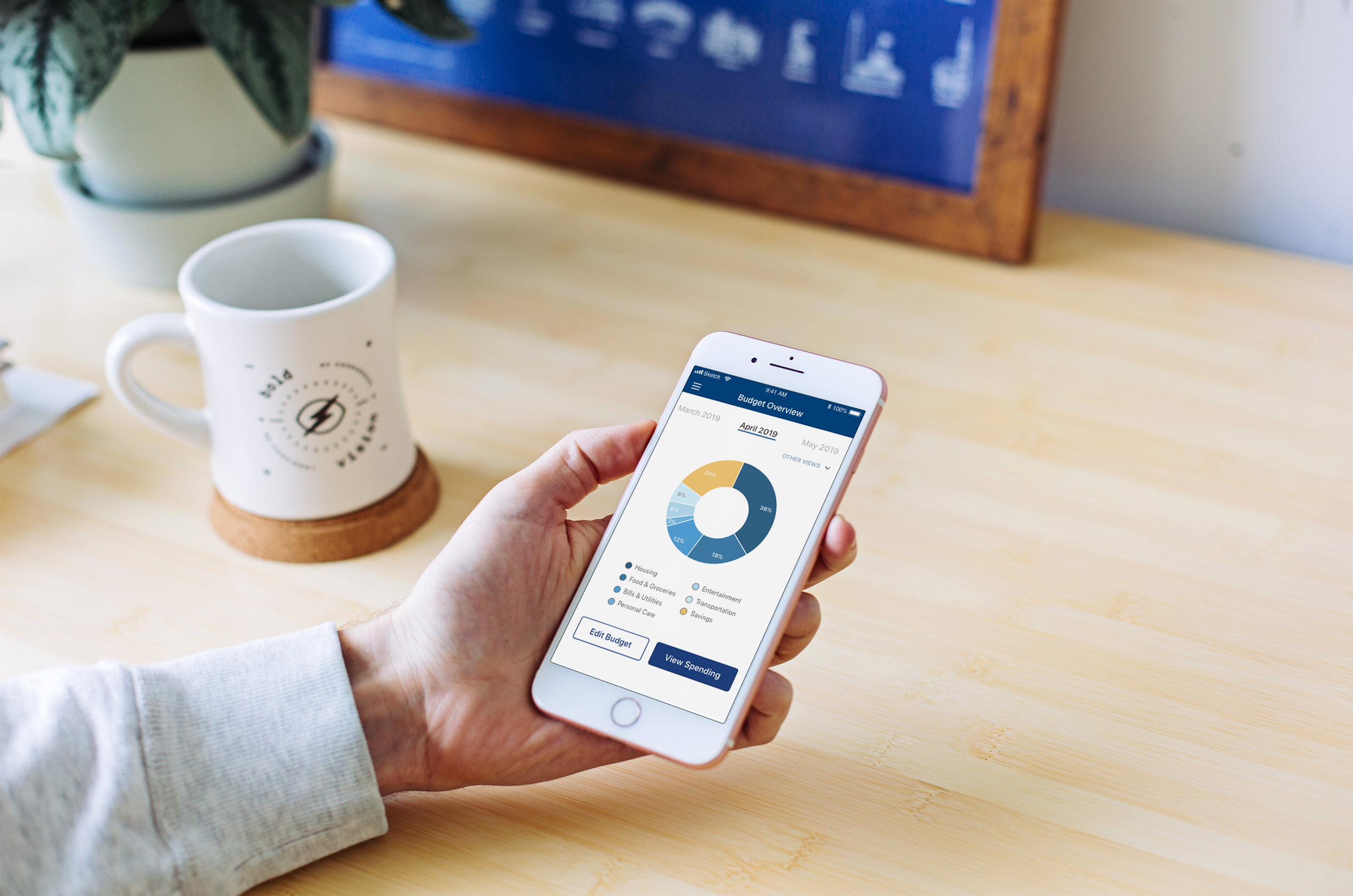
Georgia's Own Credit UnionFinTech | Feature within an App | UX/UI
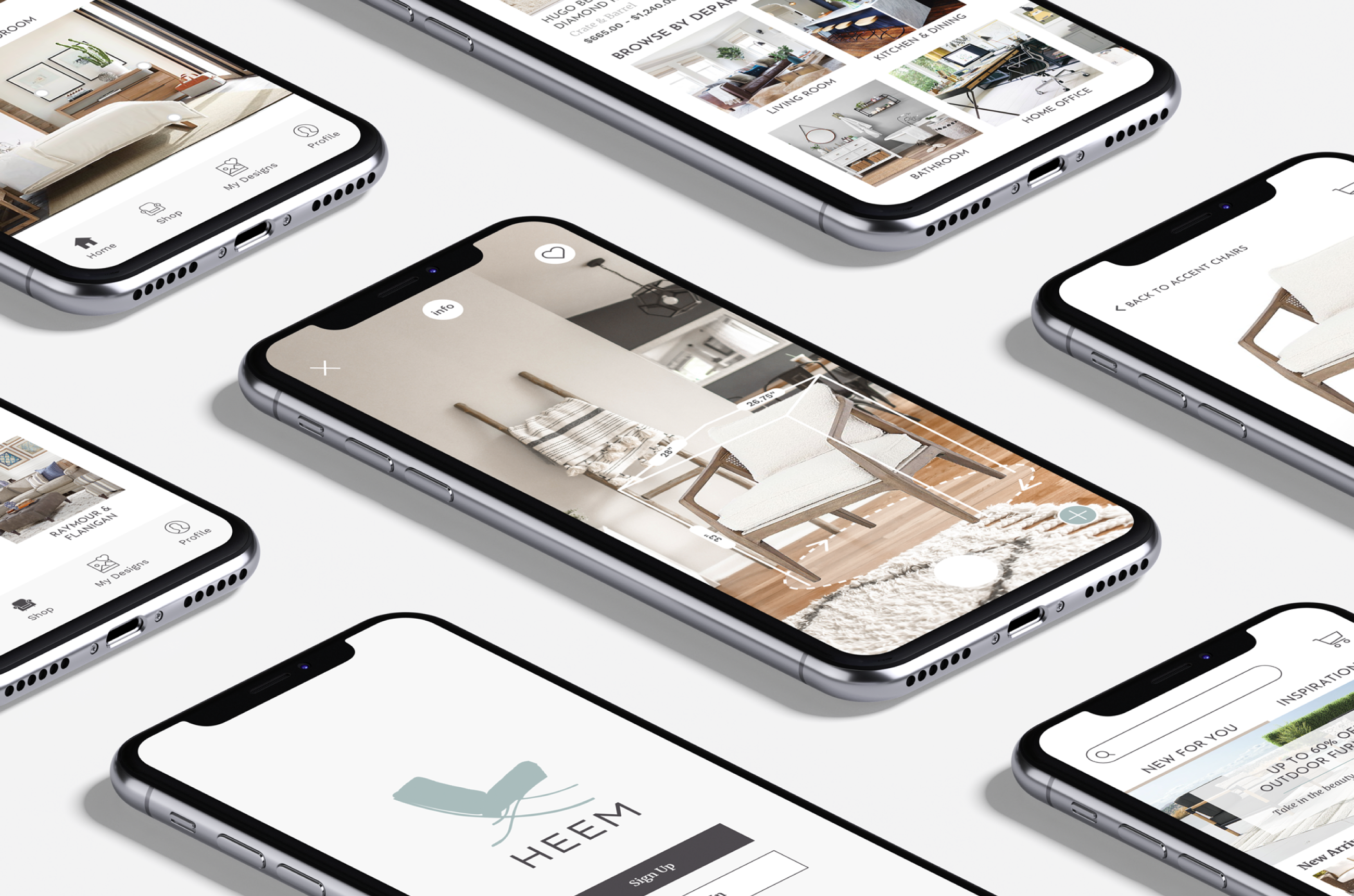
HeemAugmented Reality | End-to-End Mobile App | UX/UI | Branding

