Georgia's Own Credit Union
Designing a feature within an existing app.
Georgia's Own Credit Union
Designing a feature within an existing app.
Project Background
Georgia’s Own Credit Union is Georgia’s third-largest credit union. They have put a lot of effort in the past on providing the most relevant products for their members, but now they want to go beyond and not just provide these products, but also tools to help them manage money better.
Georgia's Own is looking to focus on its mobile app. The latest studies show a continual increase in mobile usage for banking, which is significantly above desktop usage. Younger generations, such as millennials, expect to be able to do everything on-the-go. Georgia's Own Credit Union sees an opportunity to make a difference, and help millennials with their financial challenges.
The goal of this project was to design a new personal finance management feature that embeds within the current Georgia’s Own Credit Union app for iOS.
Project Details
Client: Georgia's Own Credit Union
Role: UX/UI Designer
Team: Solo, with mentor guidance
Deliverables: A new personal finance management feature that embeds well with the rest of the app
Duration: 80 hours
Tools: Sketch, Illustrator, Photoshop, InVision
Objectives
- Design a new personal finance management feature that embeds within the current Georgia’s Own Credit Union app for iOS
Design Process
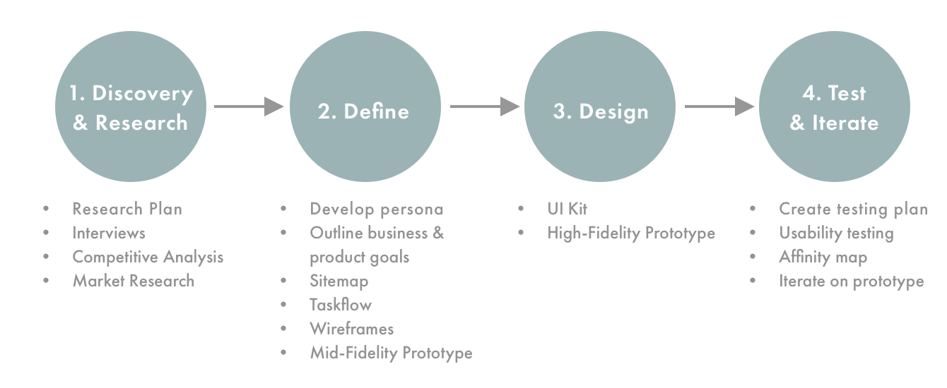
1. Discovery & Research
Process: Market Research / Competitive Analysis / Contextual Interviews
My research goals were to understand consumers' financial management needs and pains, research current online financial management tools and study other credit unions and banks to learn about the personal tools they offer.
Market Research
I aimed to learn more about how millennials felt about their financial stability and gather statistics on their financial habits to determine if there were any tools Georgia's Own could provide to help millennials better manage their money. Through my market research, it became apparent that millennials were having a hard time-saving money in general. Georgia's Own could offer some type of budgeting feature within their app in addition to helping their members set up a simple savings goal.
Summary of Findings
The recession in the late 2000’s left over 15% of millennials in their early 20’s out of work, and many are still trying to catch up financially. A study from the American Institute of Certified Public Accountants shows that millennials use a credit card to pay for basic daily necessities such as food and utilities. Over 25% of them have been charged late payments or are dealing with bill collectors, and over half of them are still receiving some financial assistance from their parents.
Seven out of ten millennials define financial stability as being able to pay all of their bills each month.
The debt burden is so substantial that more than half of millennials have put off buying a house, saving for retirement or getting married. According to a Charles Schwab survey, 36% of millennials say student loans make it a challenge for them to save money.
A PWC survey had the following statistics:
- Nearly 30% of millennials are overdrawing on their checking accounts
- Among college-educated millennials, 81% have at least one long term debt
- 53% carried over a credit card balance in the last 12 months
- Only 36% have a retirement account
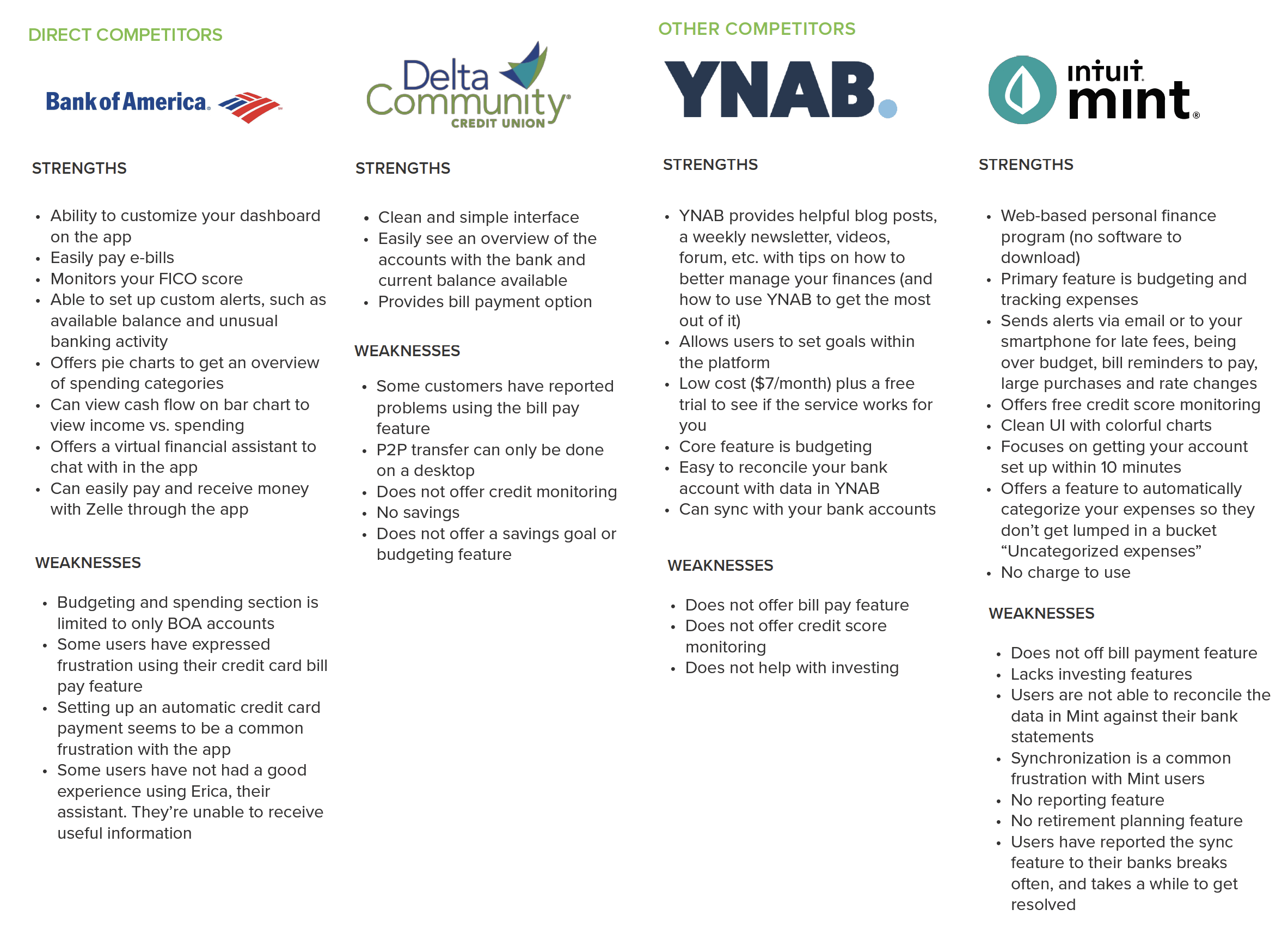
Competitive Analysis
I decided to compare Georgia's Own app and financial tools with one of the largest and most popular banks, Bank of America, along with Georgia's largest Credit Union, Delta Community, as well as two online financial management software, YNAB (You Need a Budget) and Intuit's Mint.
Contextual Interviews
To gain a better understanding of users' needs and frustrations when managing personal finances, I conducted 5 interviews with males and females, between the ages of 30-62 years. I wanted to include a couple of participants outside the targeted demographic to see if there were any successful financial habits they have implemented that I could learn from and apply to Georgia's Own new feature.
After completing my interviews, I compiled the feedback to determine potential users needs, wants and desires in a new budgeting tool:
Needs:
- Users need to feel like budgeting is simple and easy to start implementing
- Users need a way to be able to easily categorize their expenses via the apps
Wants:
- Users want to be able to easily establish a budget
- Users want to be consistent about budgeting
- Users want to see a visual breakdown of their spending habits
Desires:
- Users would like a way to set up an alert when an upcoming bill is due
- Users desire a way to be notified of ways to save money on their current expenses, i.e. if they would be able to save money by switching to a different provider than the one they’re currently with (ex. Truebill)
2. Define
Process: Develop Persona / Sitemap / Taskflow / Wireframes / Mid-Fidelity Prototype
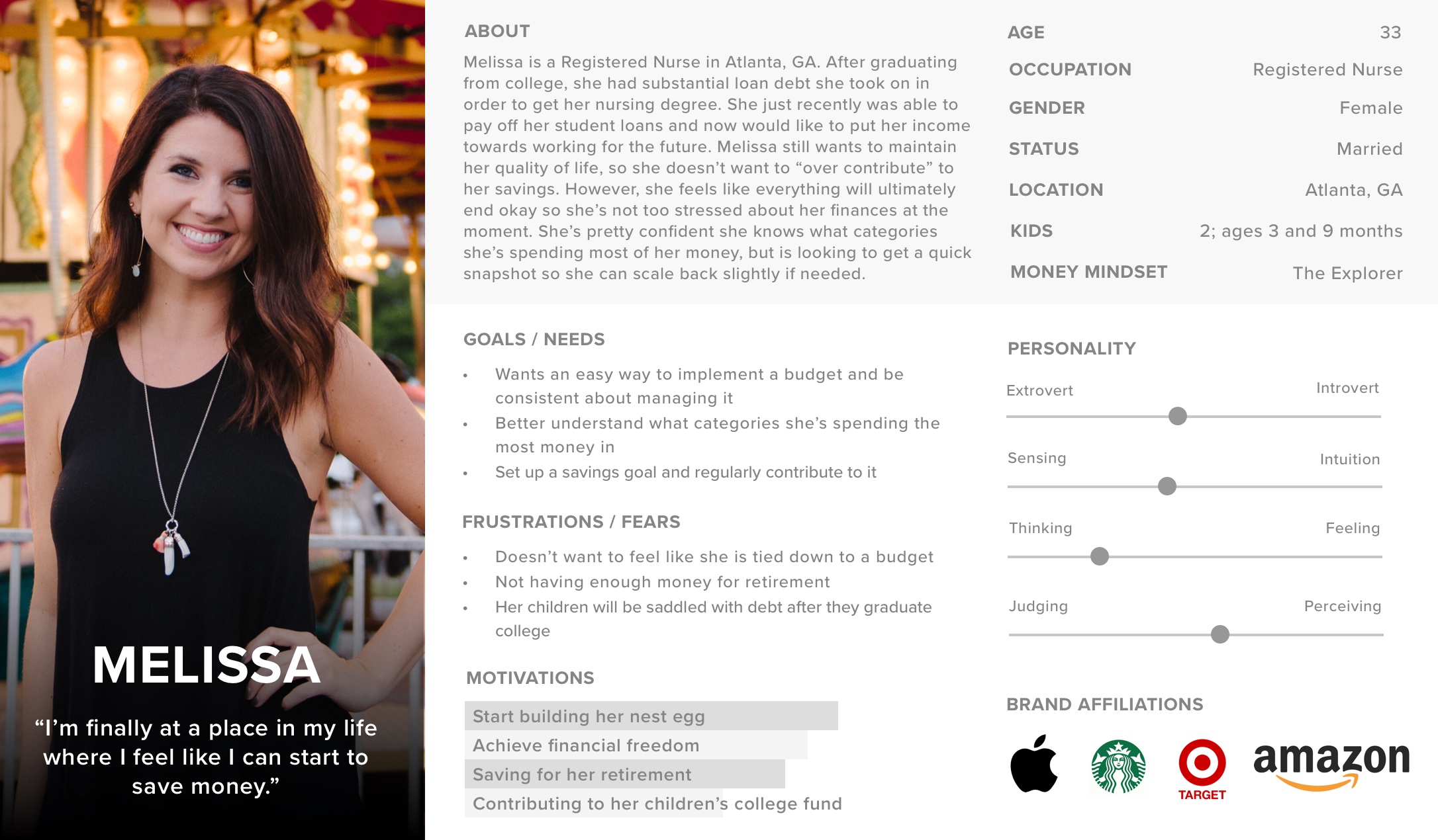
Based on my interview findings and market research, I created a persona, Melissa, for Georgia's Own Credit Union. Melissa is finally at a point her life where she is able to start saving money but is not wanting to be tied down to a strict budget. She is looking for a simple-to-use budgeting tool to keep track of where her money is going and to see if there’s any area where she could cut back her spending.
Georgia's Own has a Savings Goal feature already, but it requires a user to go through the desktop site to set up a savings goal first before it will appear within the app. I reviewed the existing app structure to determine where the new budgeting features should be added as well as sections to make changes to a member's savings goal. My proposed sitemap would allow a user to set up a savings goal and a personal budget within the app without having to visit the desktop site.
Georgia's Own has a Savings Goal feature already, but it requires a user to go through the desktop site to set up a savings goal first before it will appear within the app. I reviewed the existing app structure to determine where the new budgeting features should be added as well as sections to make changes to a member's savings goal. My proposed sitemap would allow a user to set up a savings goal and a personal budget within the app without having to visit the desktop site.
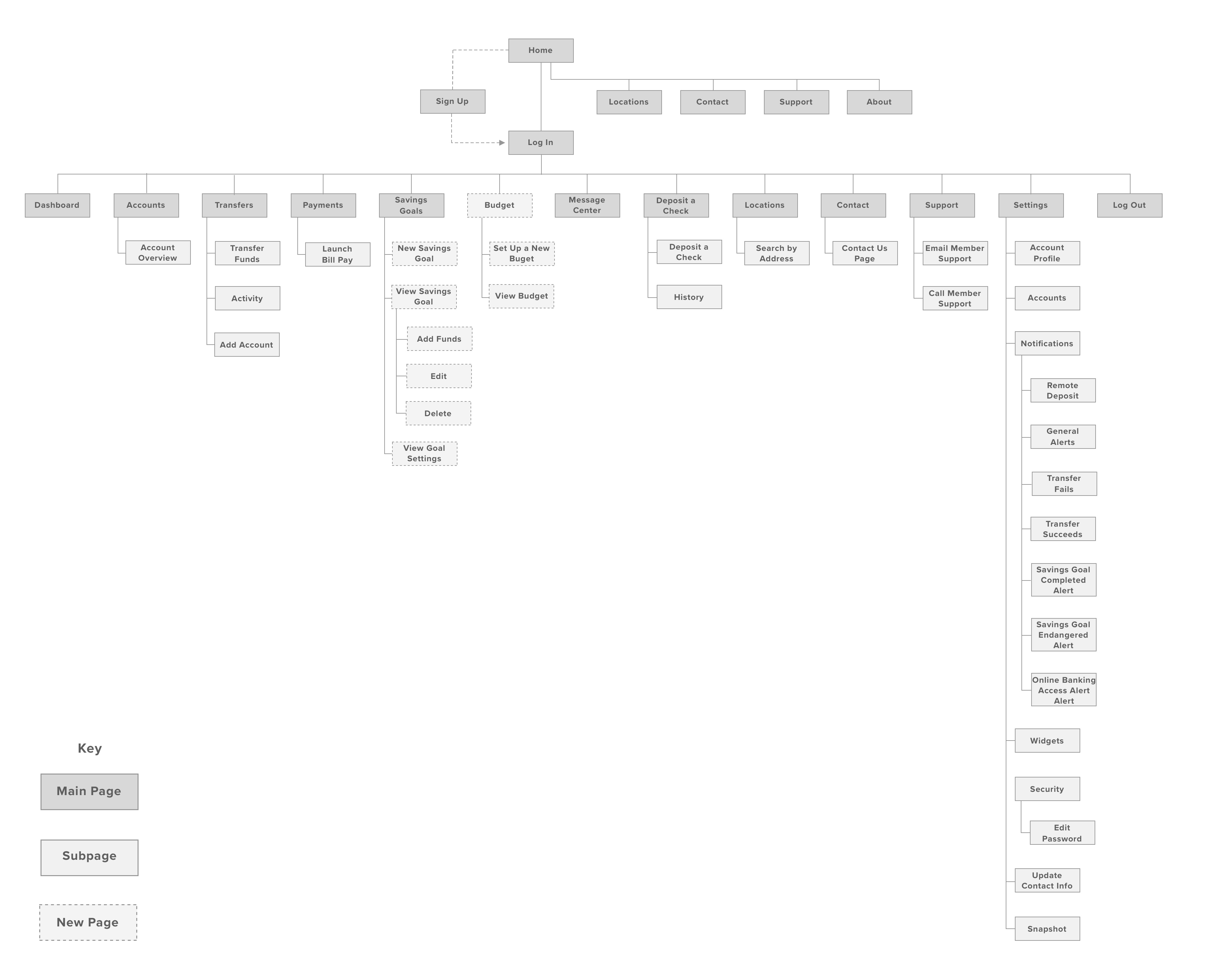
After sketching screen layouts for the new features on paper, I moved to designing the wireframes in Sketch. Georgia's Own has a very basic and simple UI so it was important to keep the same look and feel across the new screens to match the existing app.
3. Design
Process: UI Kit / High-Fidelity Prototype
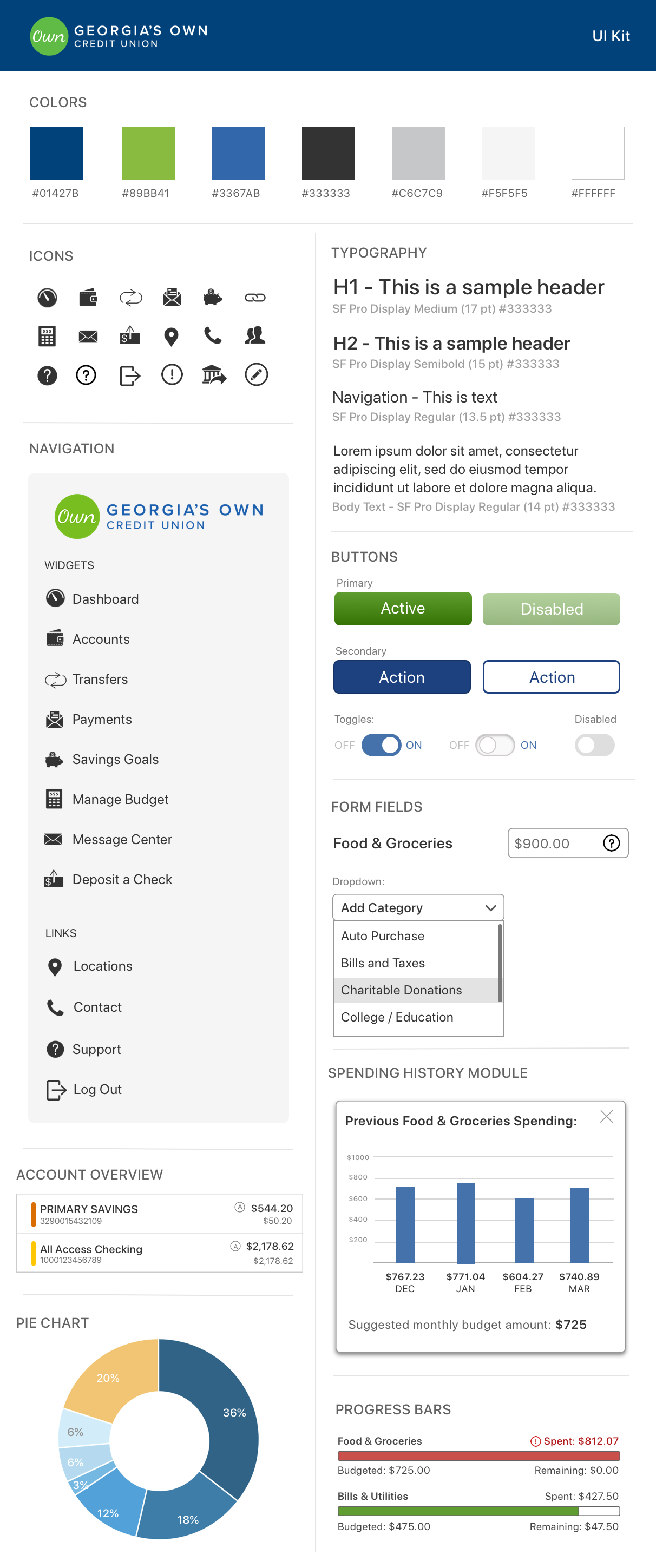
Since Georgia's Own is already an established brand, I looked to define its branding pillars. I decided on Independent, Human, Energetic and Invested as adjectives to describe their brand based on the messaging and tone used across their website and materials sent to members.
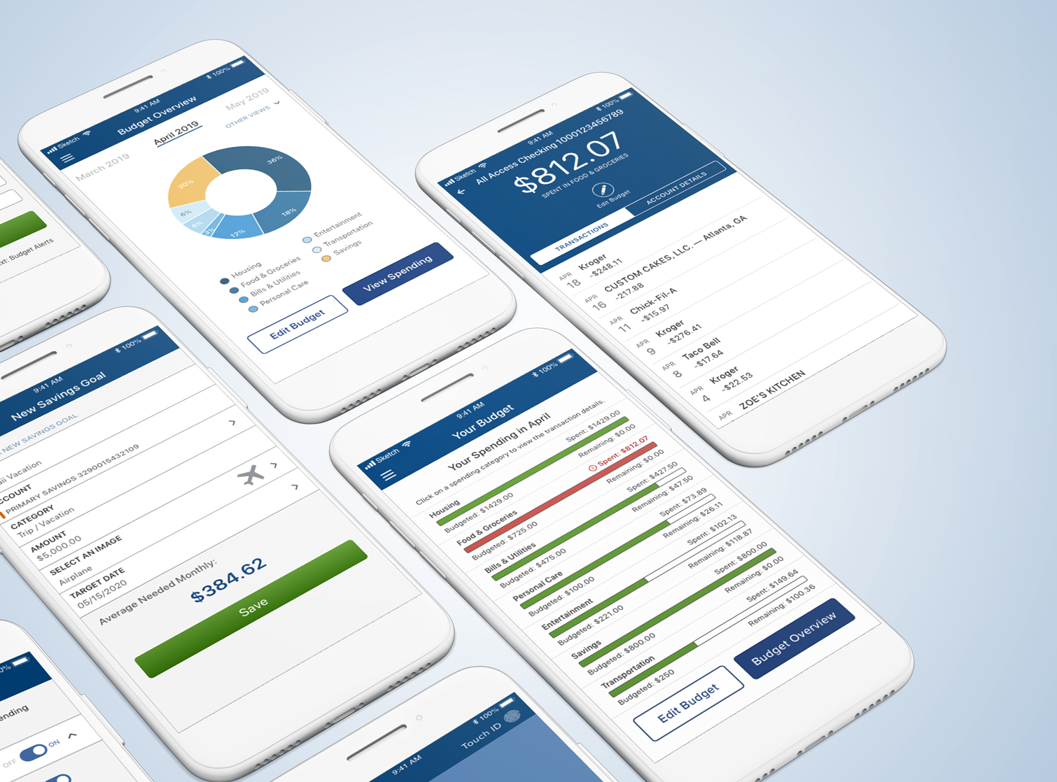
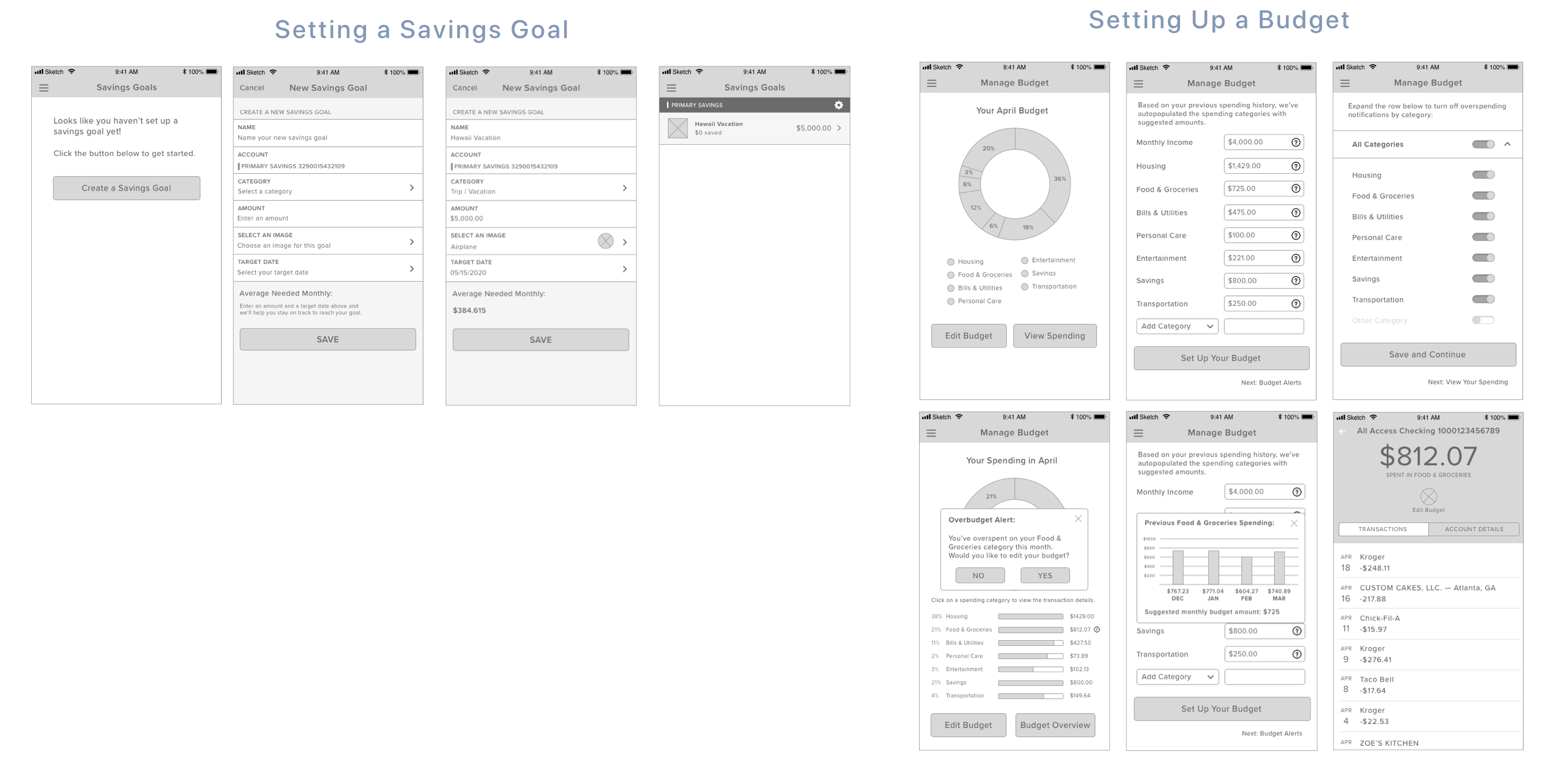
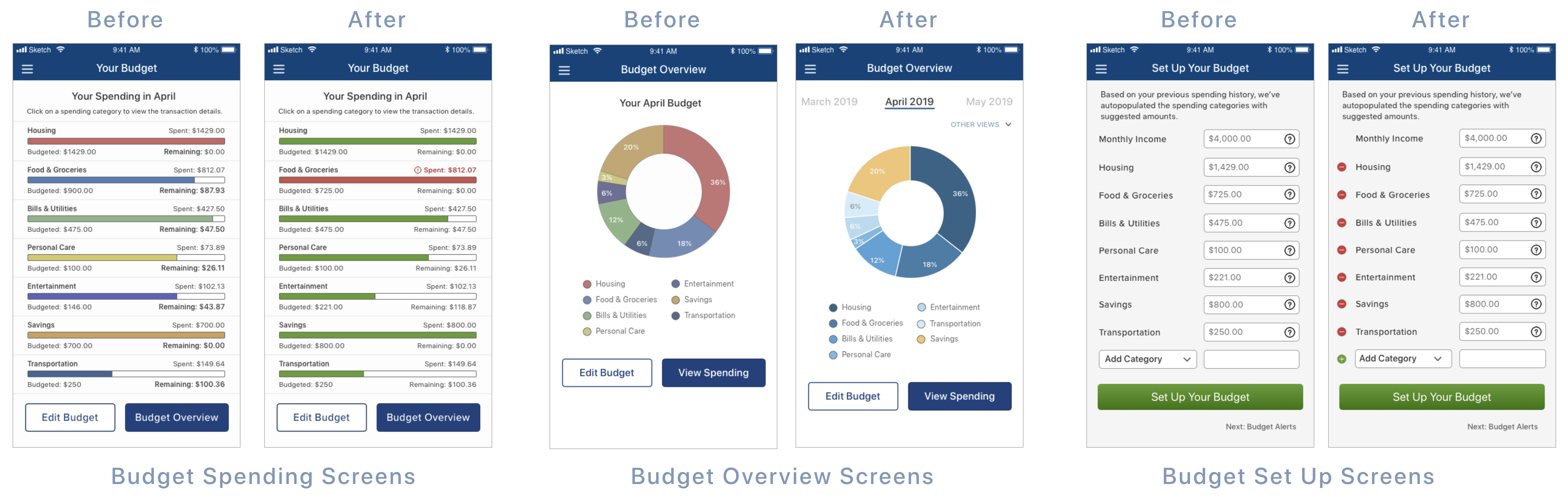
To develop the UI for the new budgeting features, I wanted to be sure any new colors integrated were complementary to Georgia’s Own brand colors. The new budgeting charts featured within the app use different hues of blue and the progress bars for the spending categories are color-coded depending on how close a user is to their allocated spending amount for that category (green for on-budget; red for over-budget).
I applied the UI across the new budgeting and savings goal screens and created my high-fidelity prototype in InVision.
4. Test & Iterate
Process: Testing Plan / Usability Testing / Affinity Map / Iterations
Once the high-fidelity prototype was ready, I put together my testing plan for potential users of the app. My test objectives were to:
- Test the overall quality of the app's new features
- Test how easy it was for the user to use the new Savings Goal and Budget features
- Identify any inconsistencies
- Determine if there were any elements that create hesitation, confusion or difficulties
The test goals were to understand how users would interact with the app, learn how I could improve the functionality and efficiency of the new features, and identify any areas of improvement that could be turned into actionable steps.
Usability Testing Feedback & Iterations
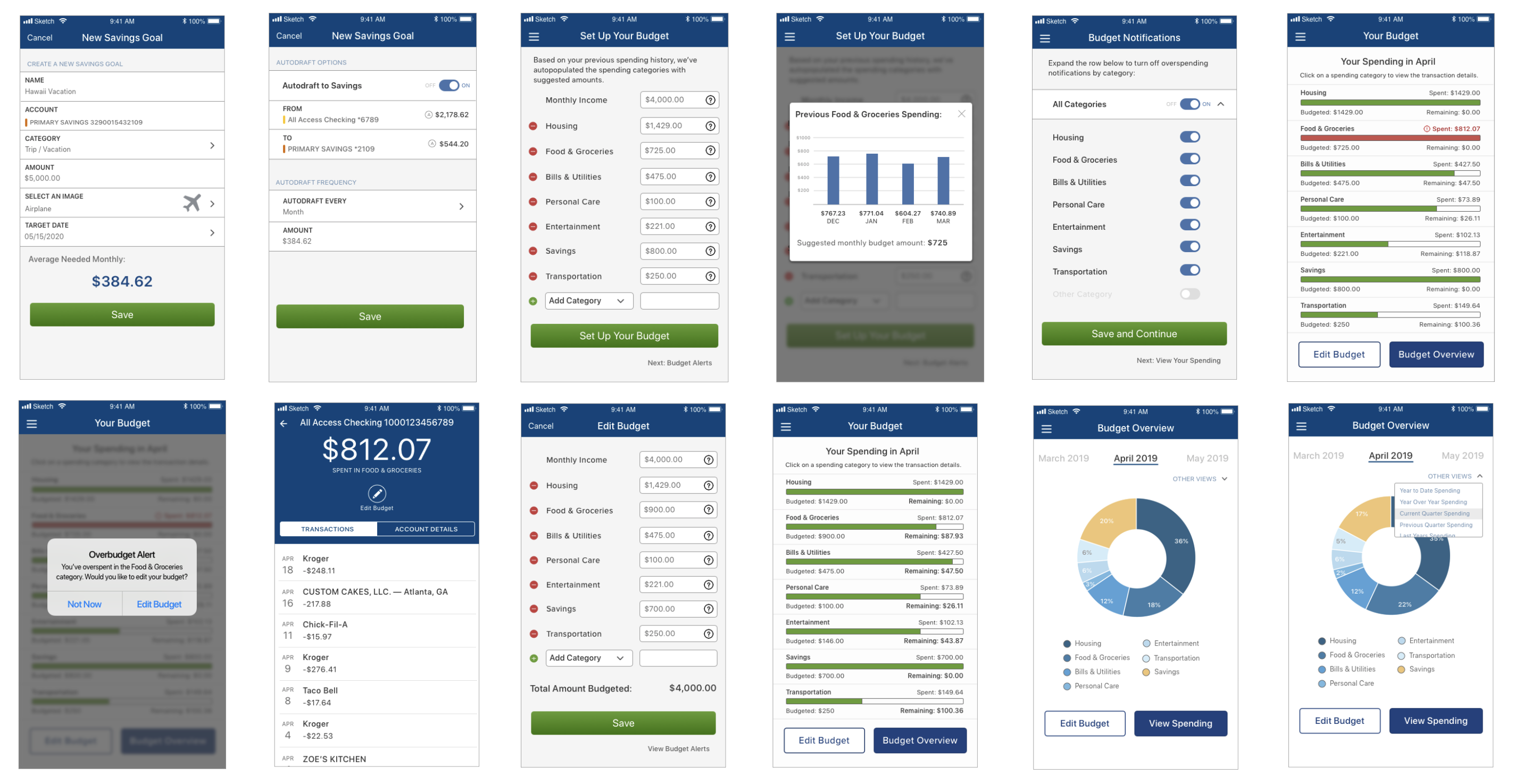
I completed usability tests with 4 people, 2 men and 2 women, who were all able to successfully complete the tasks provided. Overall, the test users liked the app and thought it was pretty straightforward to use. Most surprisingly, 3 out of 4 of the participants were not a fan of the colors used for the graphs and progress bars. 3 out of 4 participants also asked questions about how they could customize their spending categories within their budget, or how they could add or remove a category.
The spending history pop up module in the initial budget set up screen was well-received overall. Other popular questions during testing were how to view previous and future months' budgets, and if it was possible to view spending Year-to-Date (YTD) or Year-Over-Year (YoY).
After completing the first round of usability tests, I made the highest priority round of revisions. A couple of my test users thought the colors of the budget progress bars had a meaning, i.e. that red stood for an alert. Giving the budget progress screen more thought, I decided to only incorporate two colors: green for on-track spending and red for over-budget spending.
I also updated the colors on the pie chart to be more pleasing to the eye and a better match for Georgia's Own Credit Union brand. I created additional viewing options within the Budget Overview screen (view future and past months, YTD or YoY spending), as well as added an auto-draft option for the Savings Goal feature. Additionally, I incorporated an option to add or remove budget spending categories during the budget set up screens.
Next Steps
Given more time, I would like to work on making the pie chart within the new budgeting feature more interactive and complete additional usability testing before preparing the design for developer hand-off.
One challenge I faced during this project was initially coming up with a budget feature as each one of my participants in my user interviews had a different method and various amounts of experience with budgeting. Therefore, prioritizing the features that would be basic enough for a “new” budgeter to use as well trying to incorporate elements that a slightly more experienced budgeter would appreciate, was certainly a challenge.
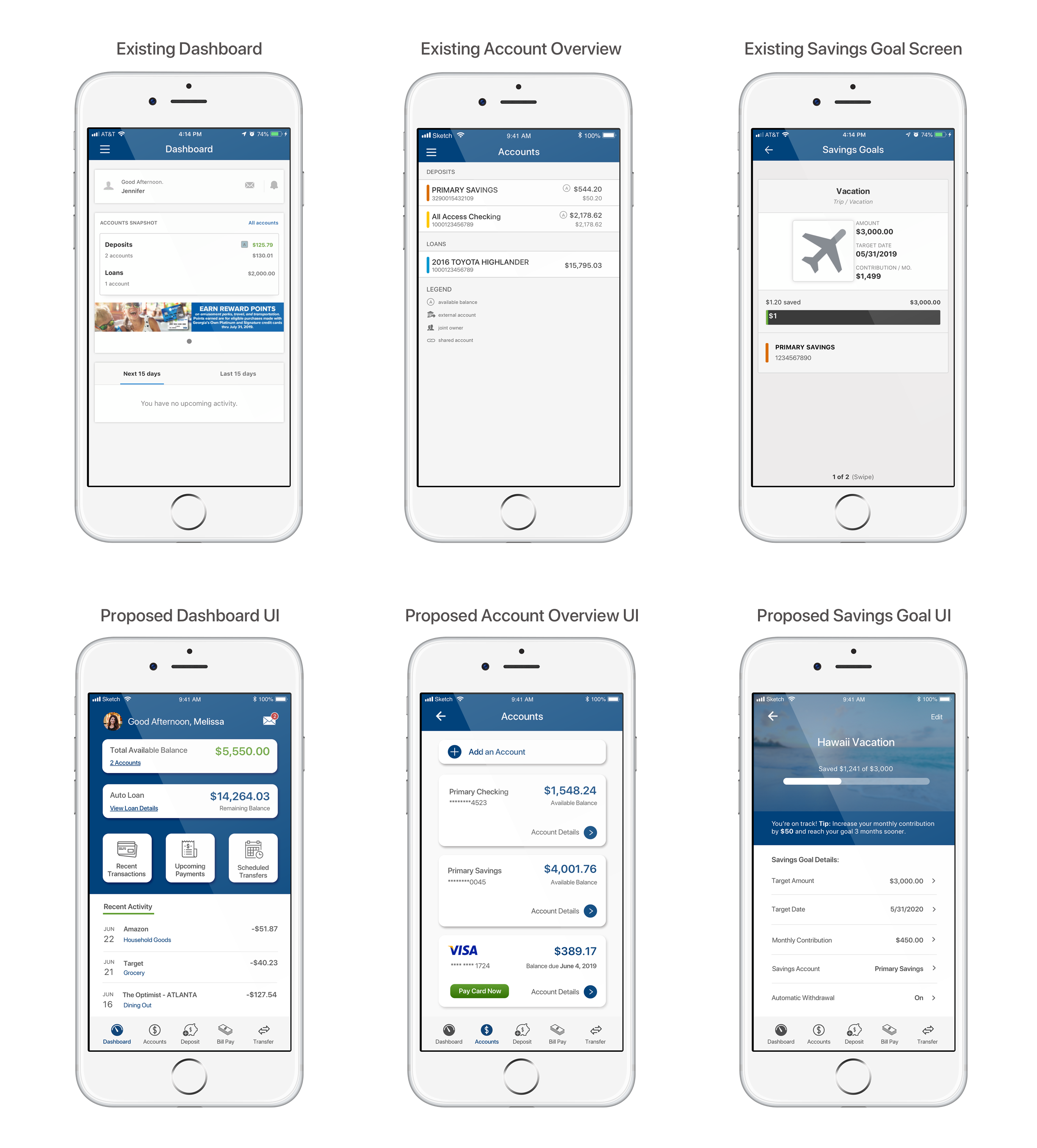
Another challenge I experienced was working within an app that felt a bit outdated with the UI. While developing the new features and creating the screens, I did my best to keep with the current UI used throughout Georgia’s Own existing app. I thought it would be fun to see how the app could potentially look with a more modern design and how the new UI could enhance a member's overall experience:
View more projects
MirrorE-commerce | Responsive Design | UX/UI | Branding

The Crate EscapeNonprofit | Responsive Design | UX/UI | Branding
Georgia's Own Credit UnionFinTech | Feature within an App | UX/UI
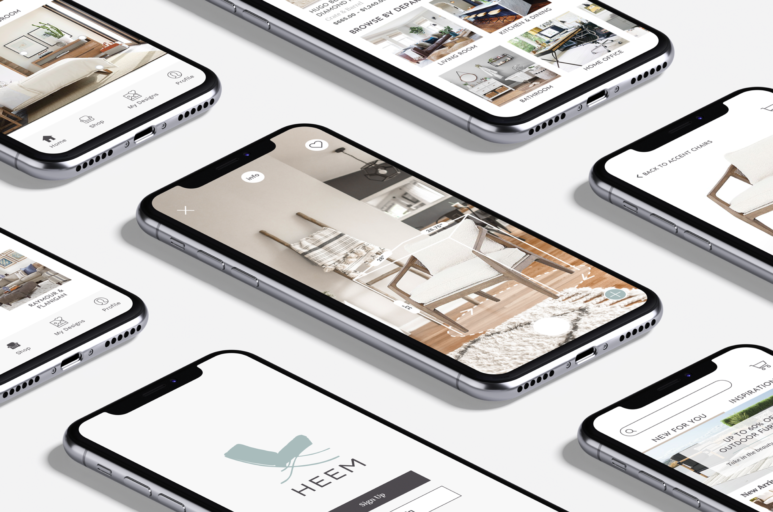
HeemAugmented Reality | End-to-End Mobile App | UX/UI | Branding